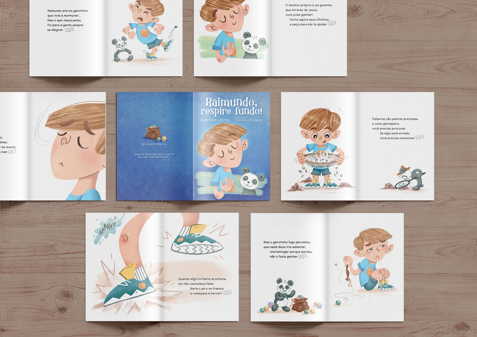
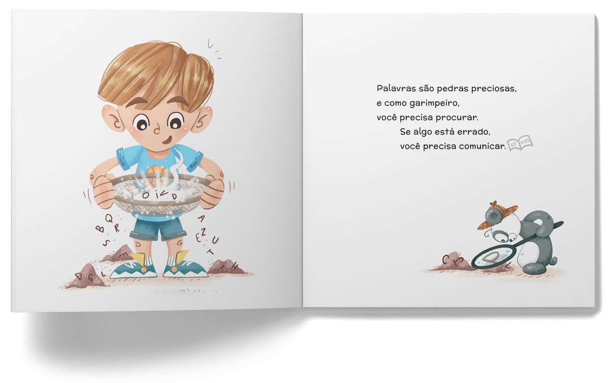
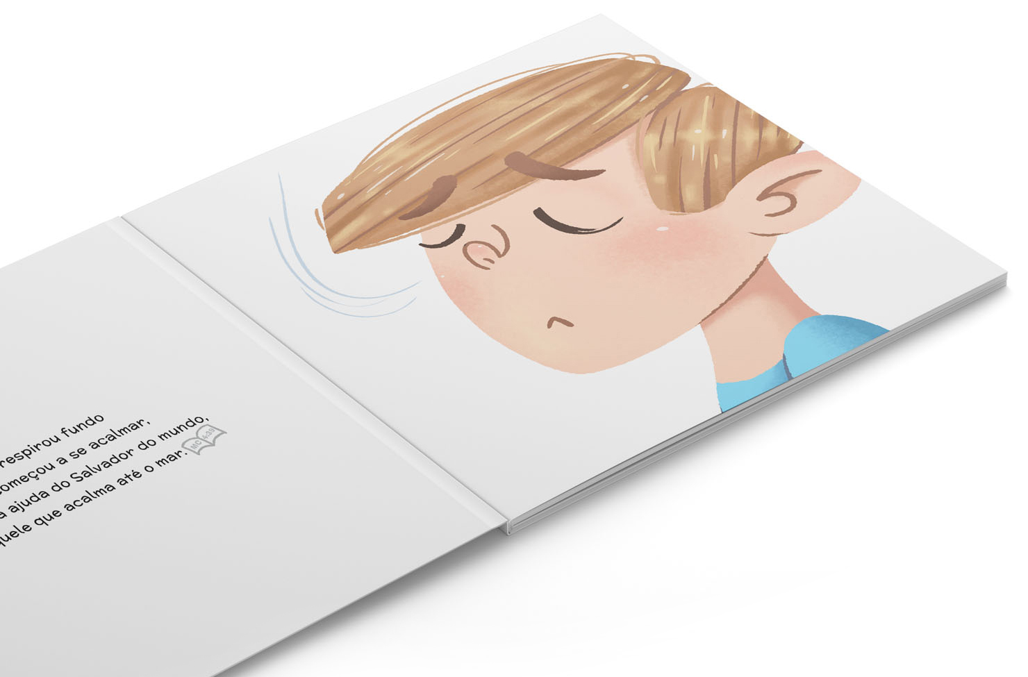
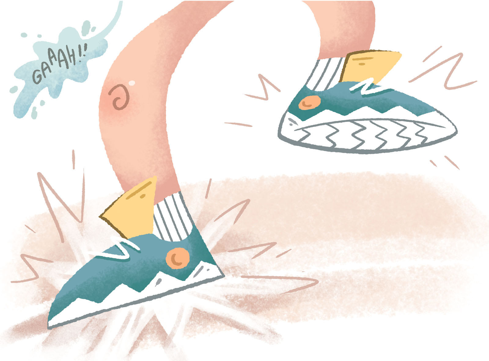
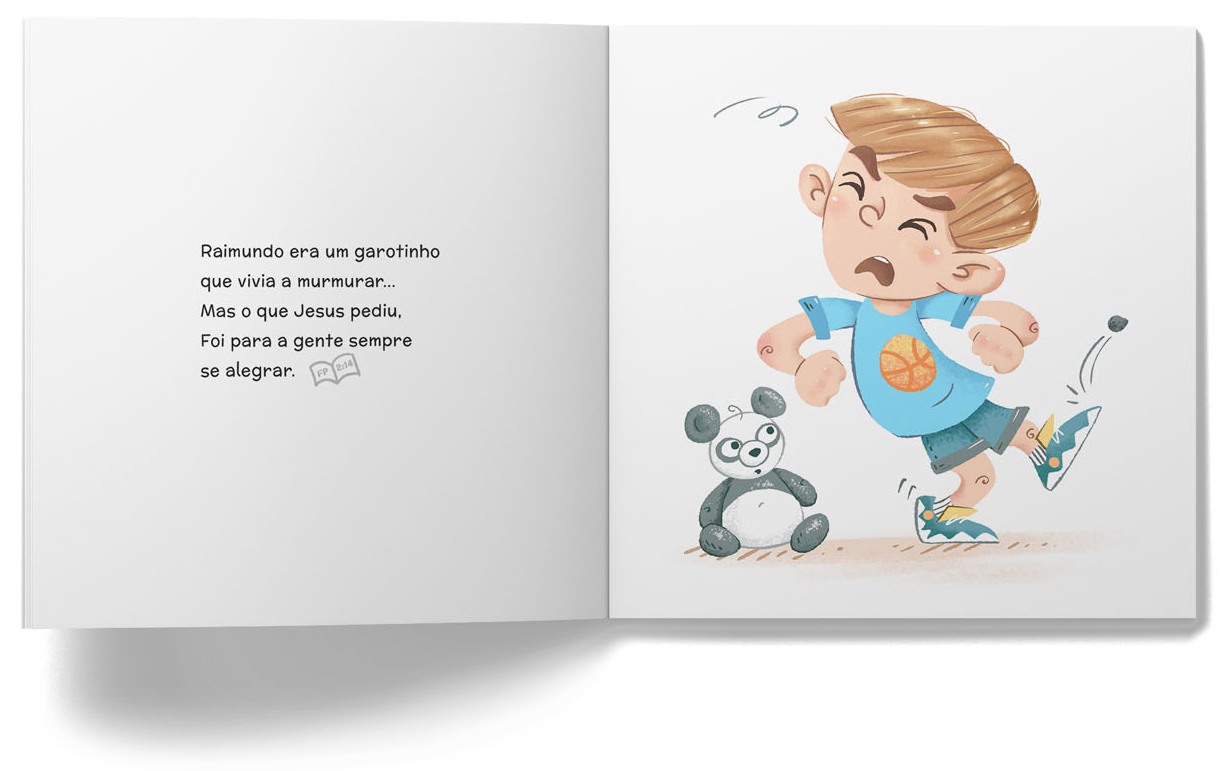
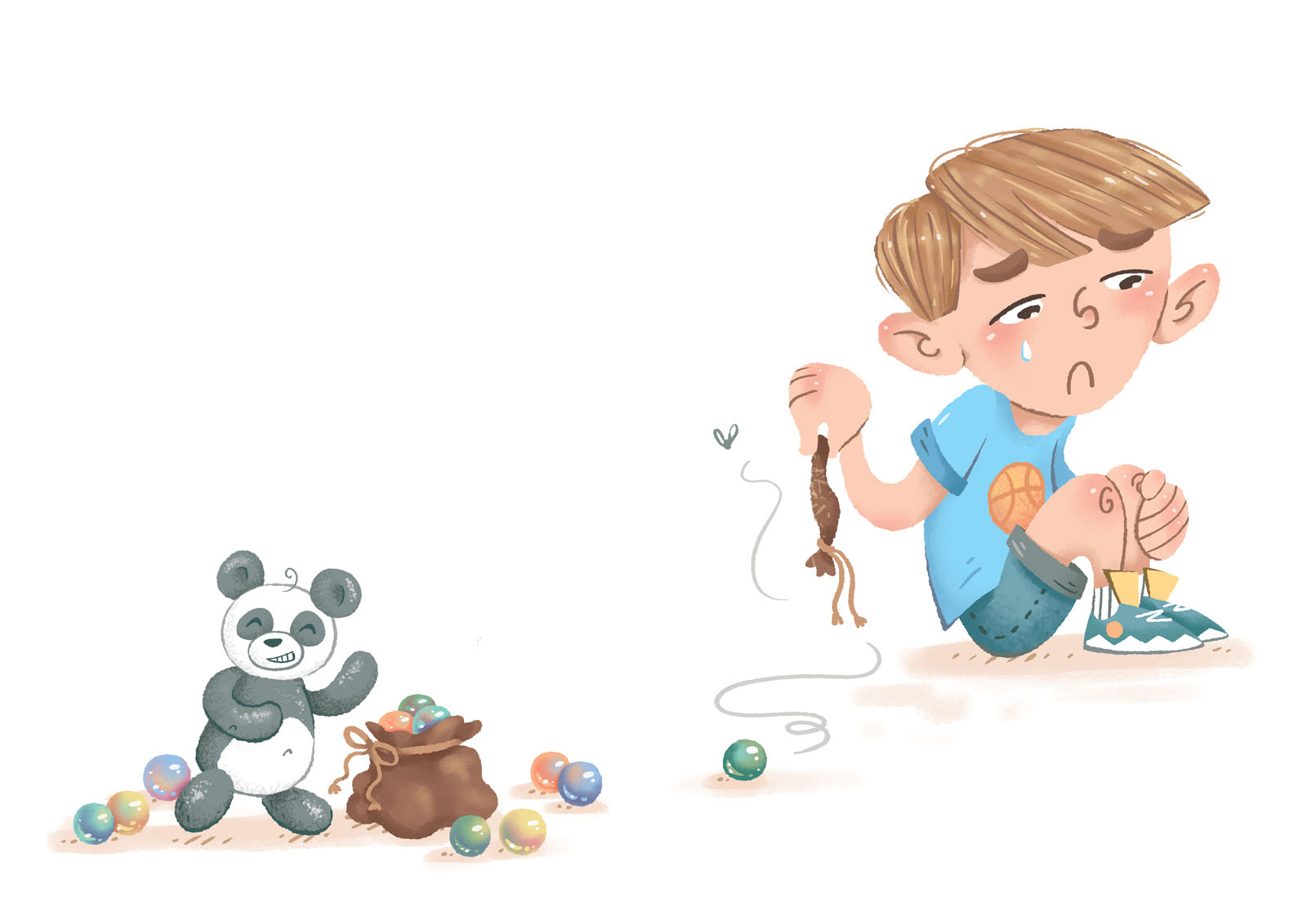
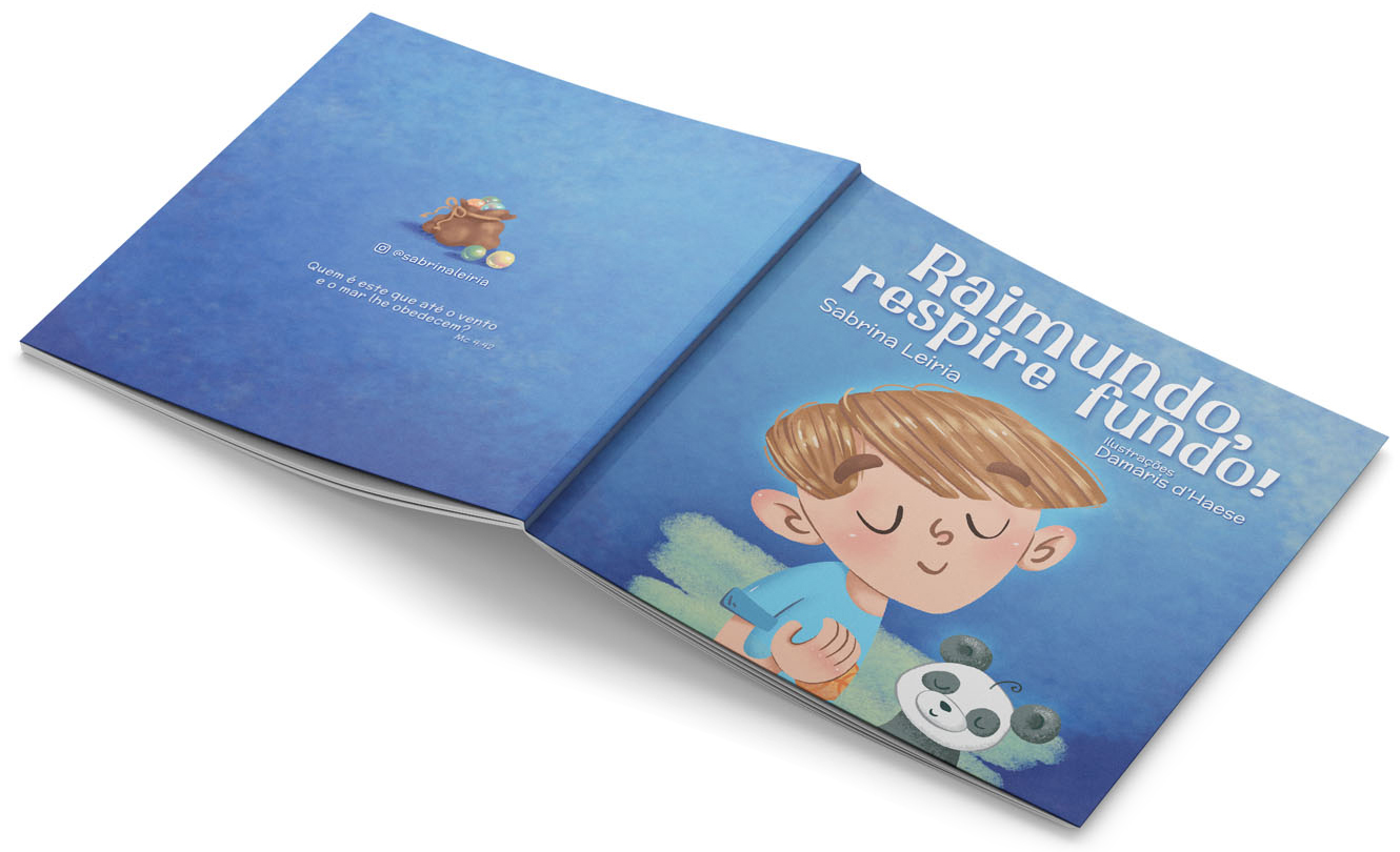
Motivated by the joy she felt interacting with her children through storytelling, Sabrina Leria wrote this charming tale that follows Raimundo, a young boy that sometimes struggles to express his feelings of anger and frustration. By drawing from the challenges and triumphs of her own parenting journey, Sabrina aspires to craft narratives that resonate with families grappling with comparable situations. She strives to provide a constructive framework for addressing conflicts, nurturing stronger familial bonds, and empowering children to navigate the inevitable ups and downs of growing up.
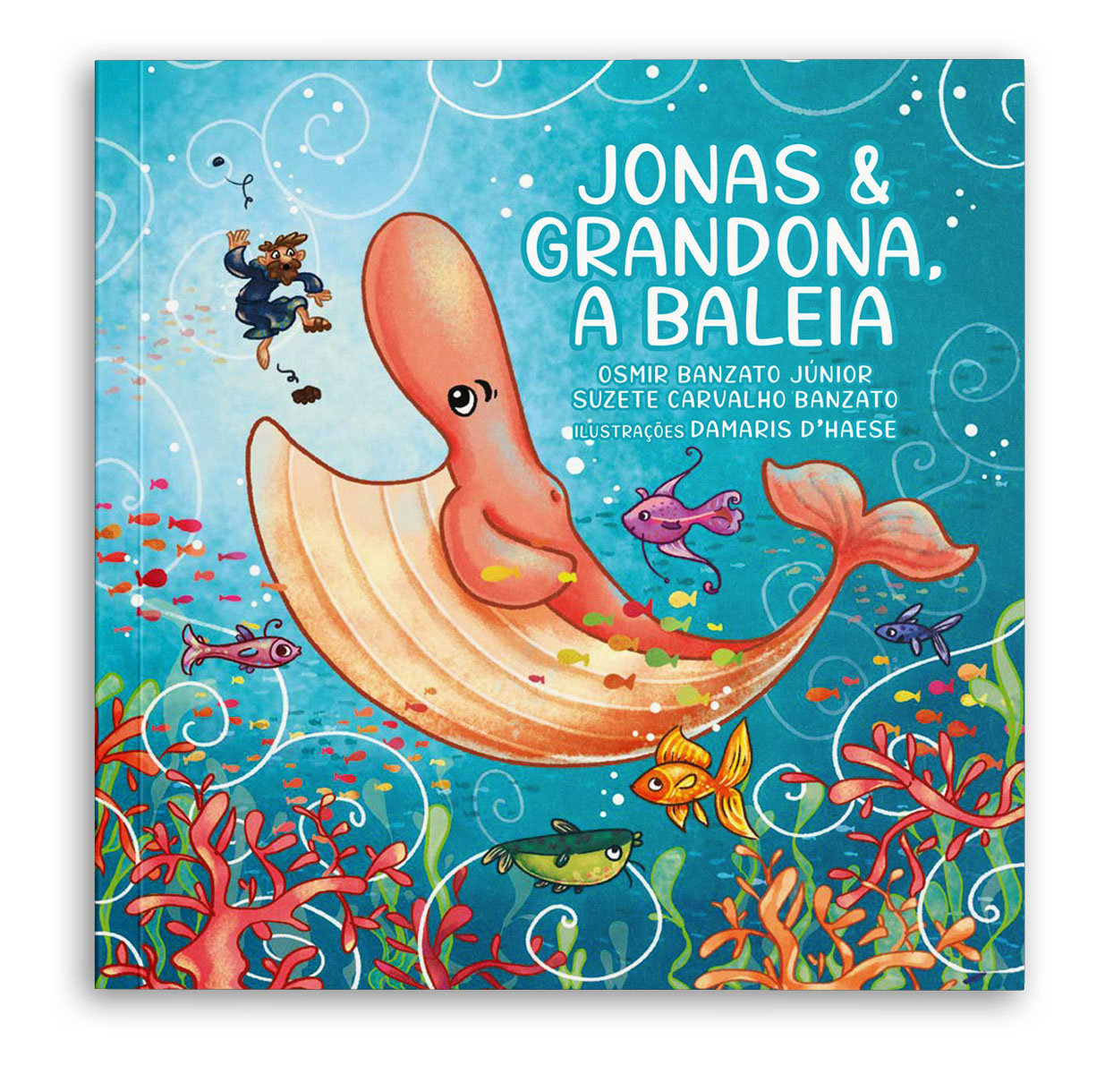
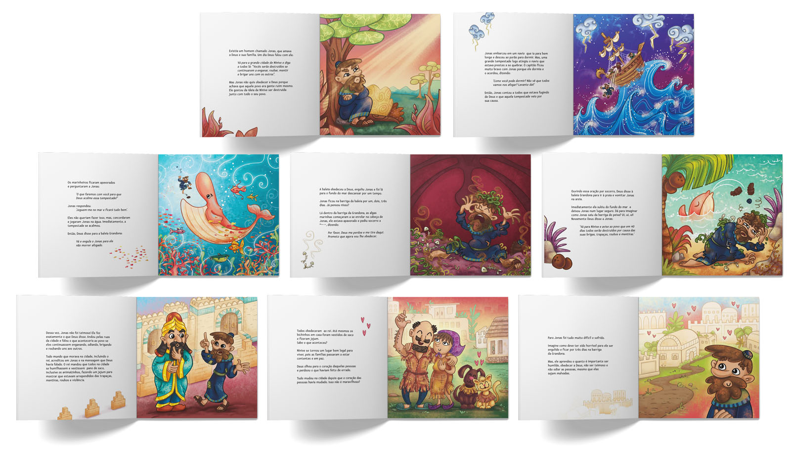
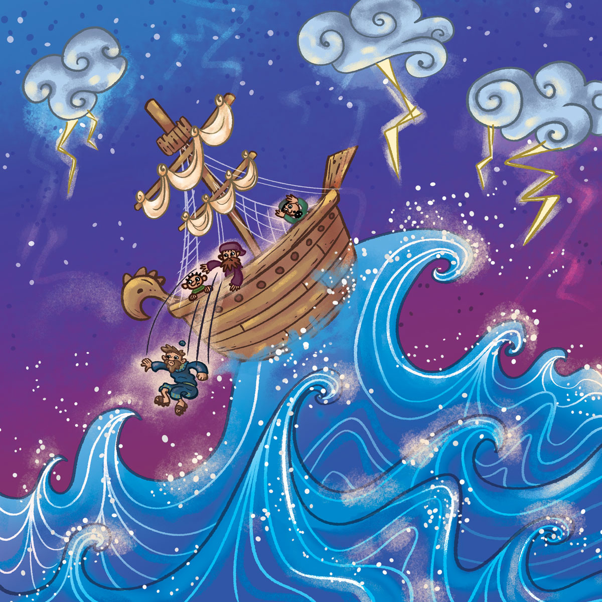
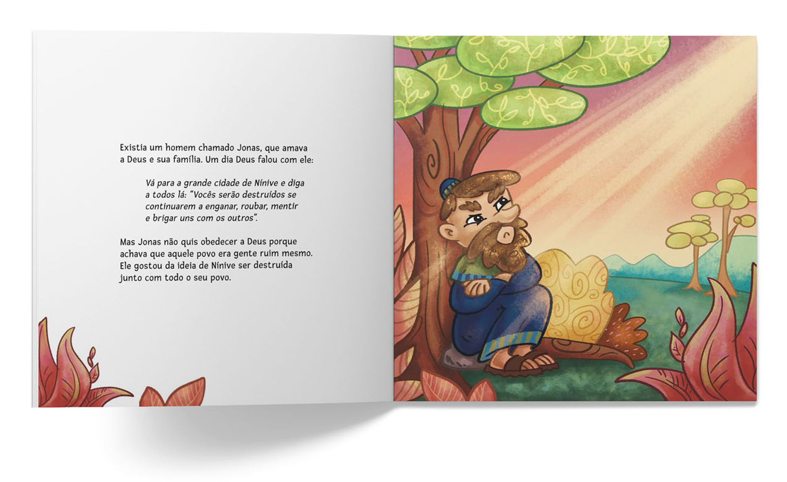
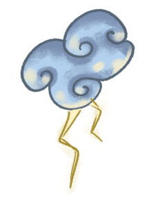
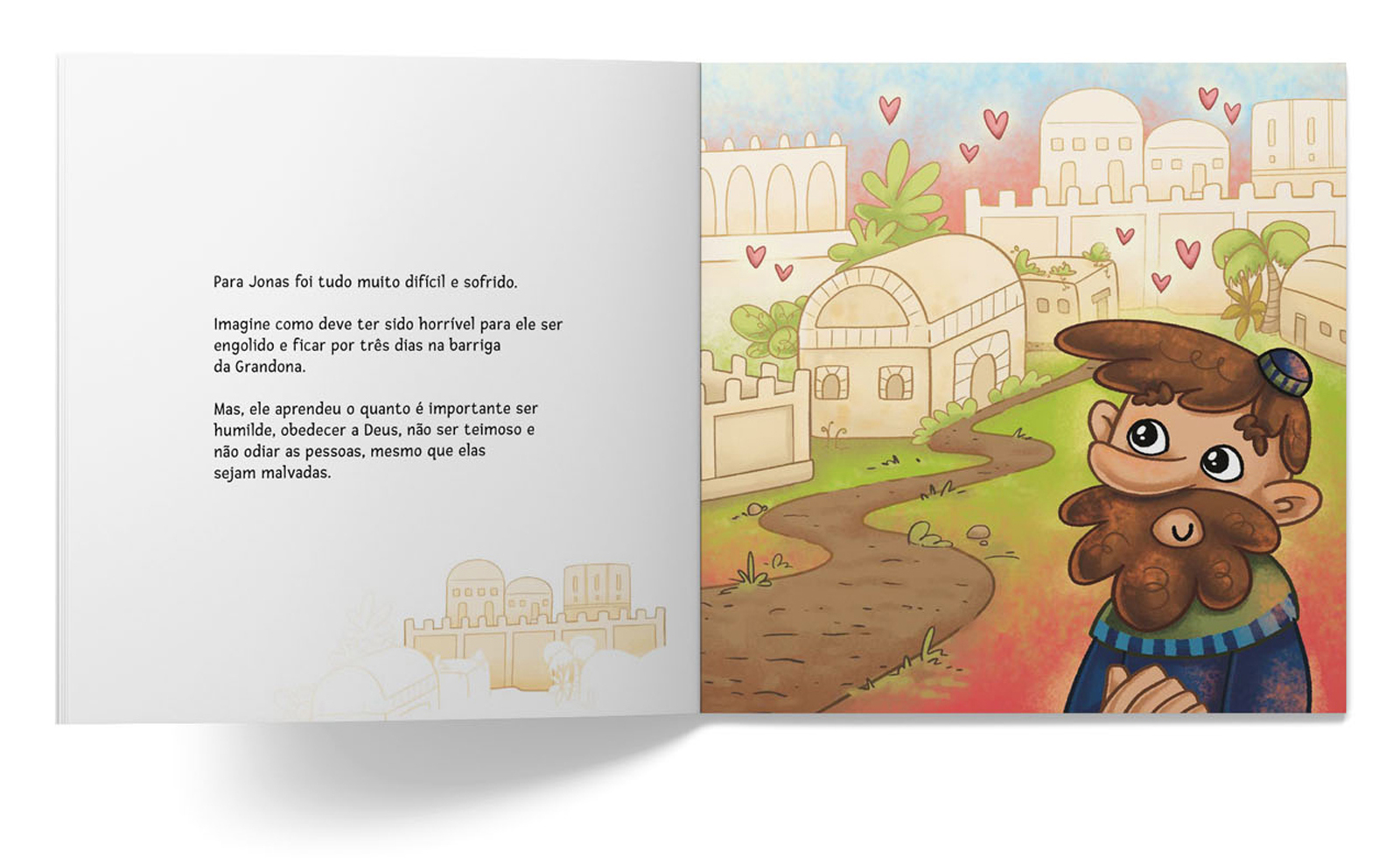
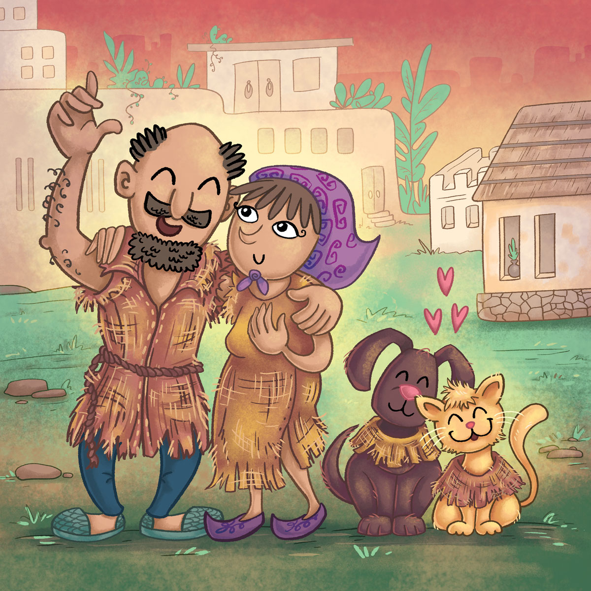
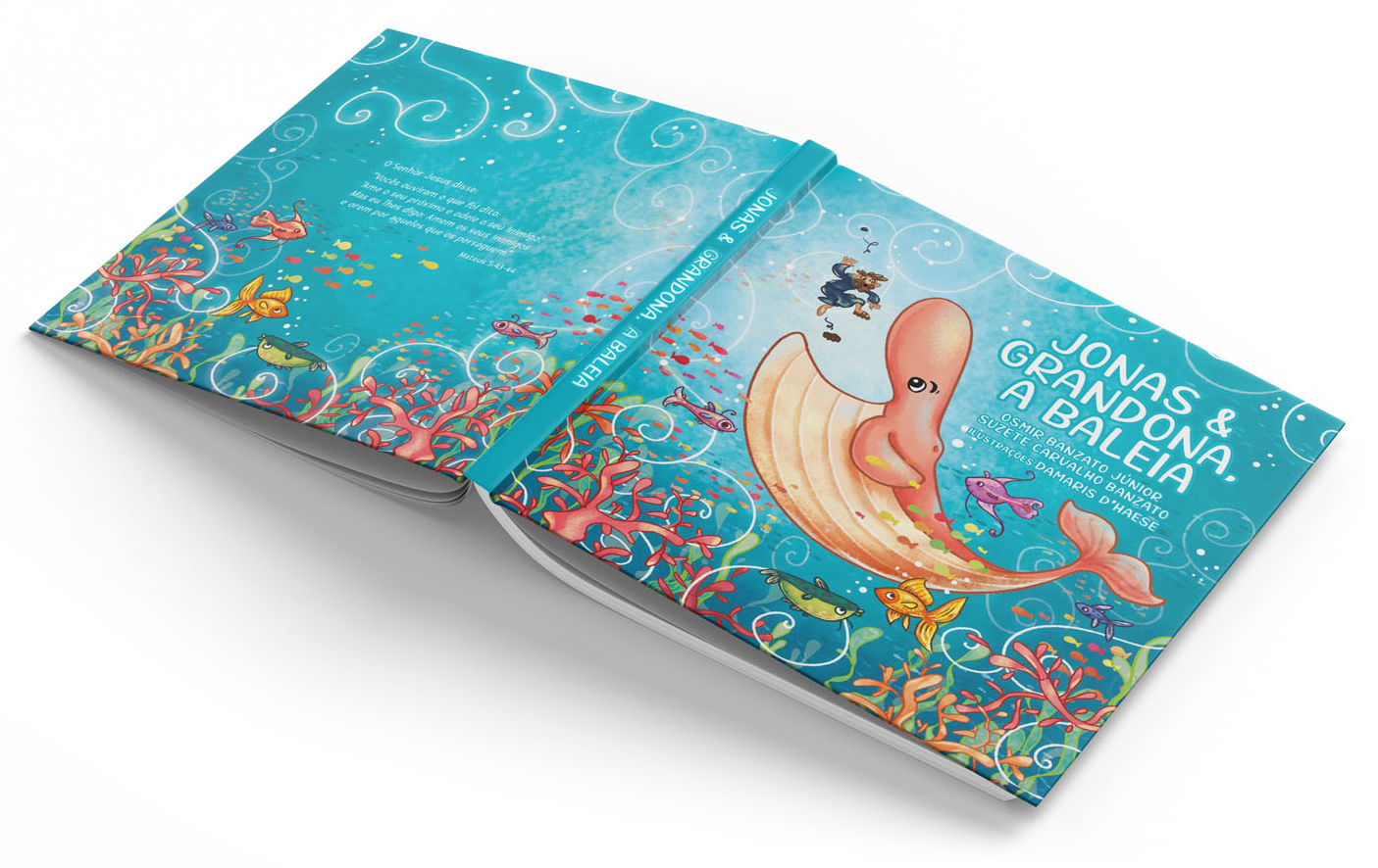
The classic tale of Jonas and the Whale, written by Osmir and Suzate Banzato. Jonah, a prophet from an ancient civilization, is tasked with delivering a crucial message to the inhabitants of a distant city. Defying this responsibility, he attempts to flee and ends up being eaten by a big fish. The narrative concludes with Jonah being confronted with the concept of forgiveness, even for those he deemed unworthy, ultimately highlighting the transformative power of redemption when individuals and communities acknowledge their misdeeds and strive to make amends.
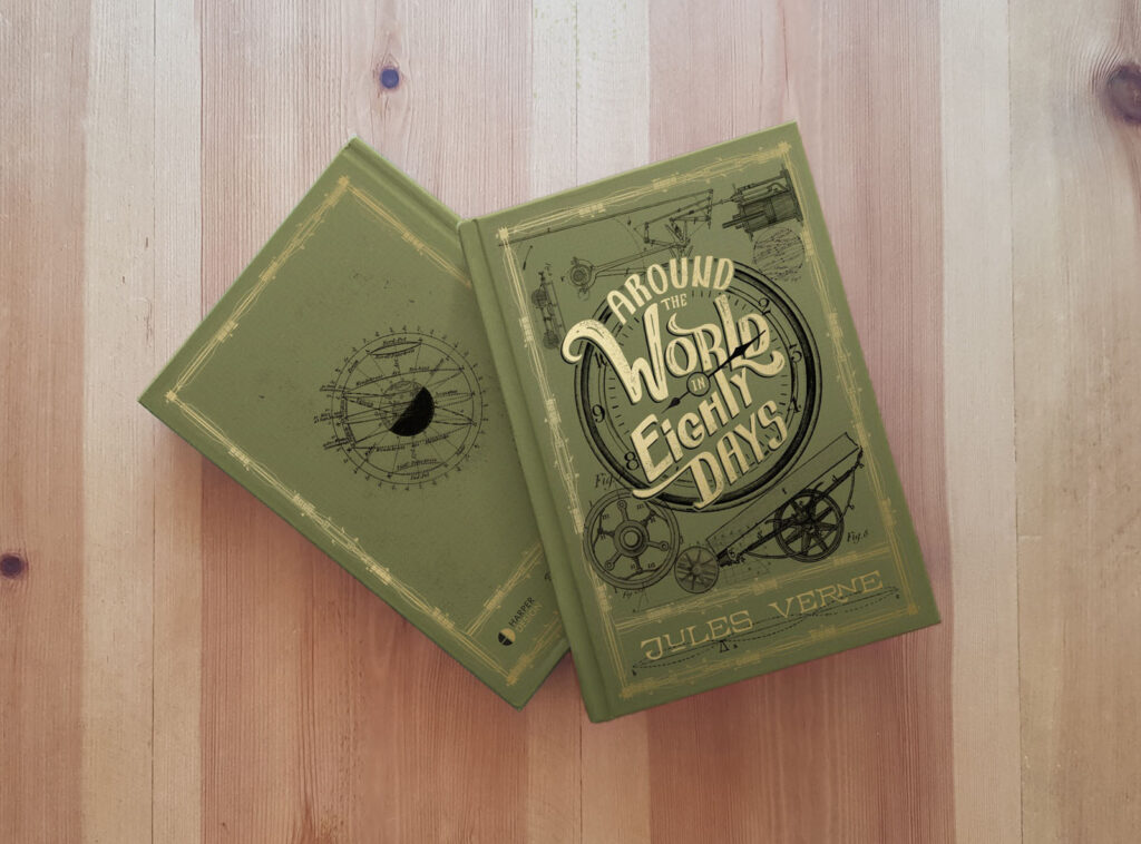
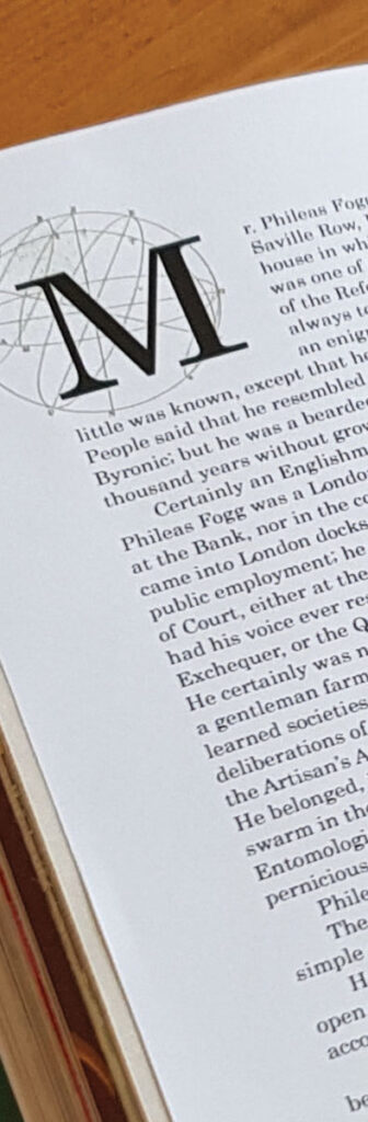
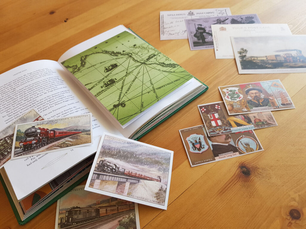
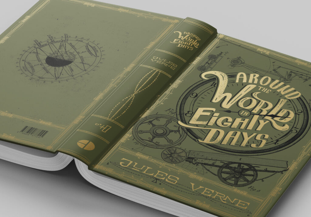
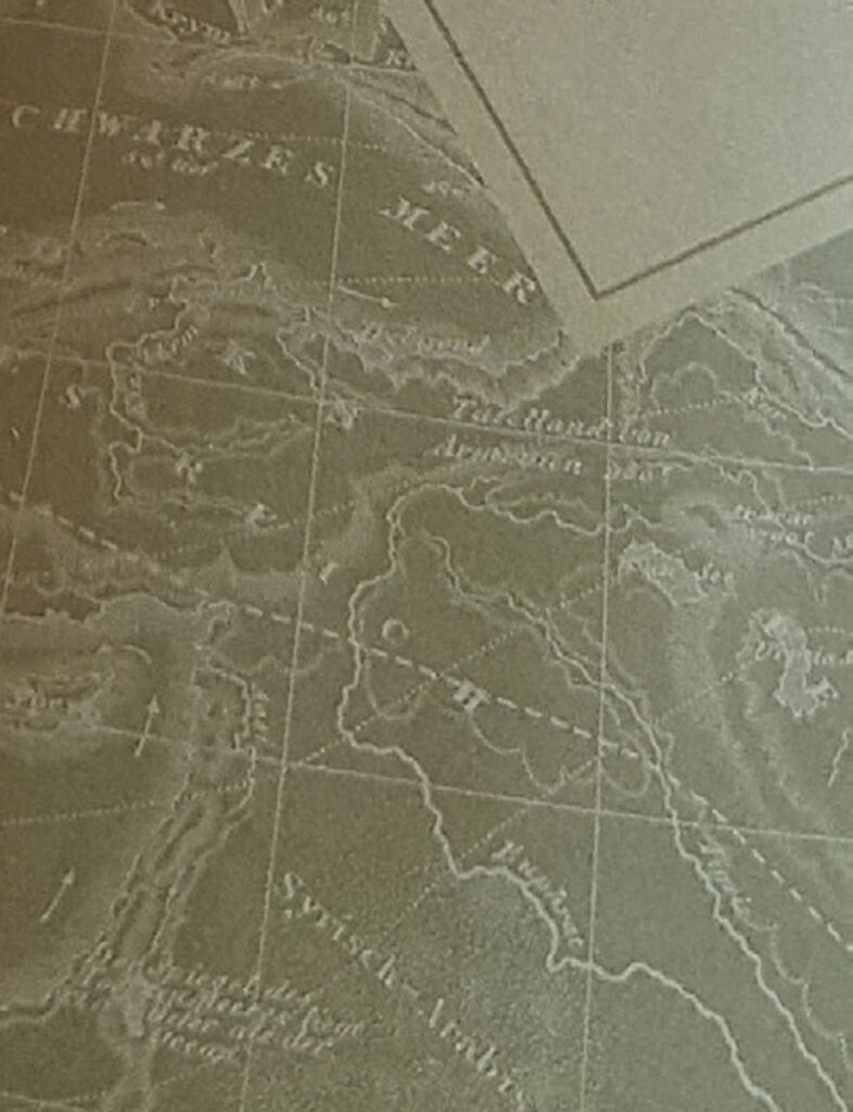
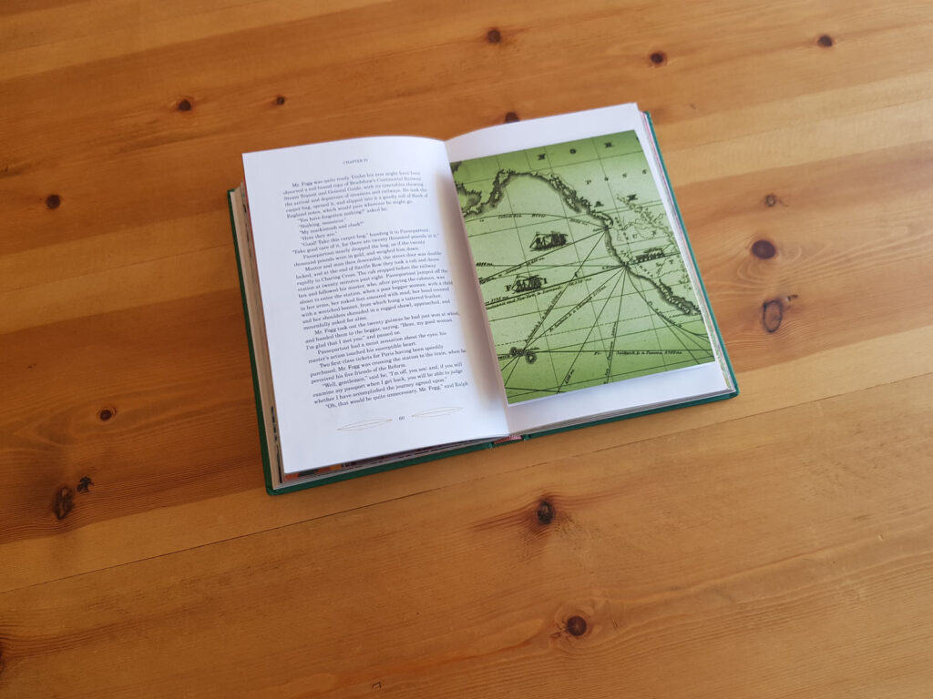
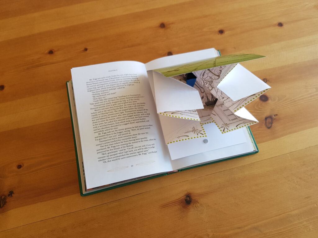
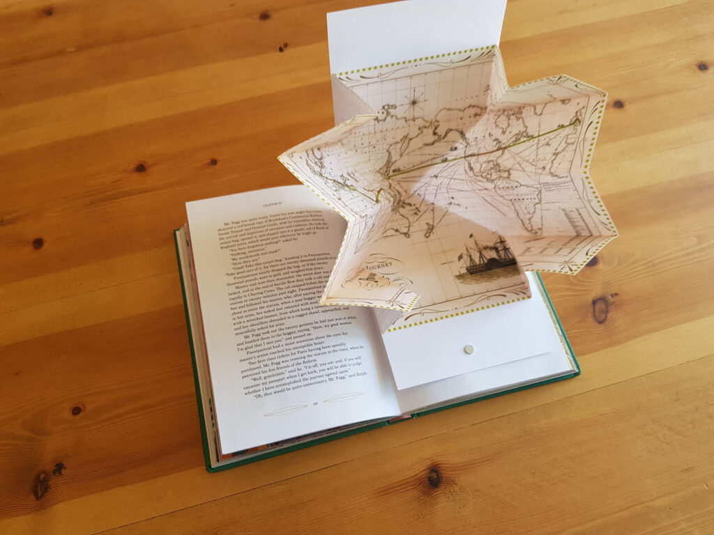
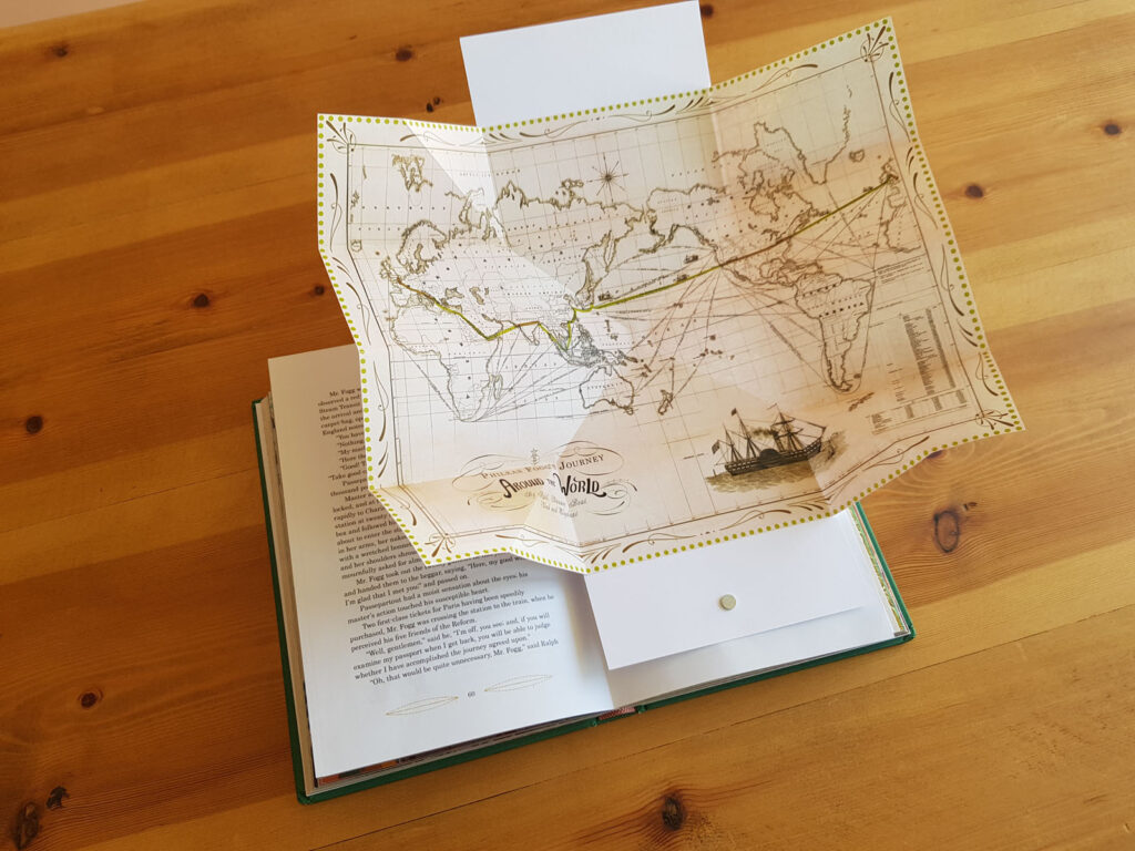
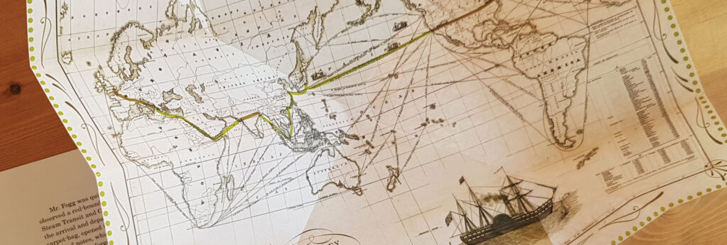
To design this collector’s edition of Jules Verne’s “Around the World in 80 Days”, my starting point was investigating the historical context surrounding what I consider to be the main theme of this narrative – a fascination with emerging technologies from the Industrial Revolution. This led me to also explore innovations in print and graphic design from that era, as I aimed to utilize its distinct visual language to communicate the story and create an immersive, interactive reading experience.
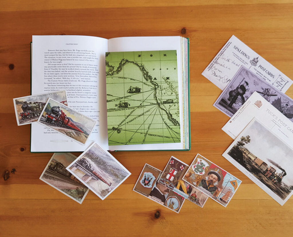
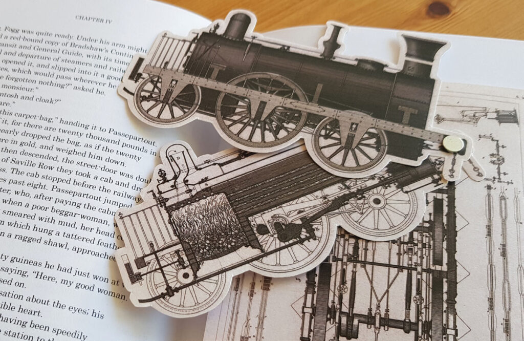
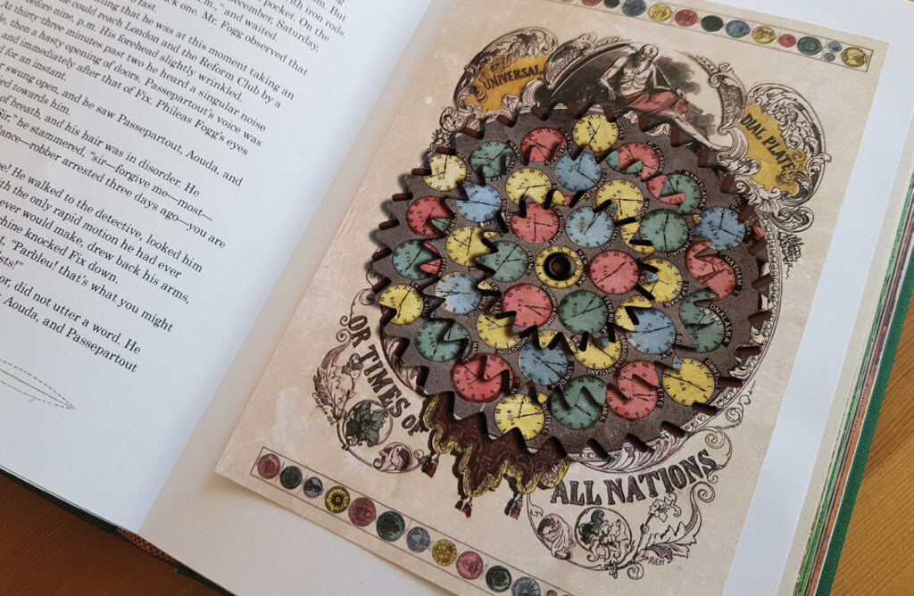
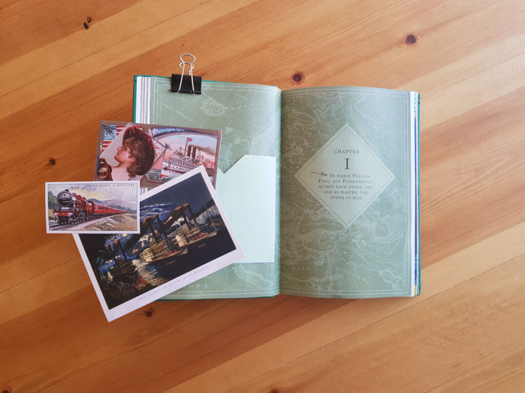
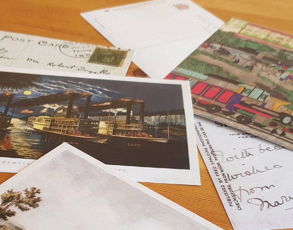
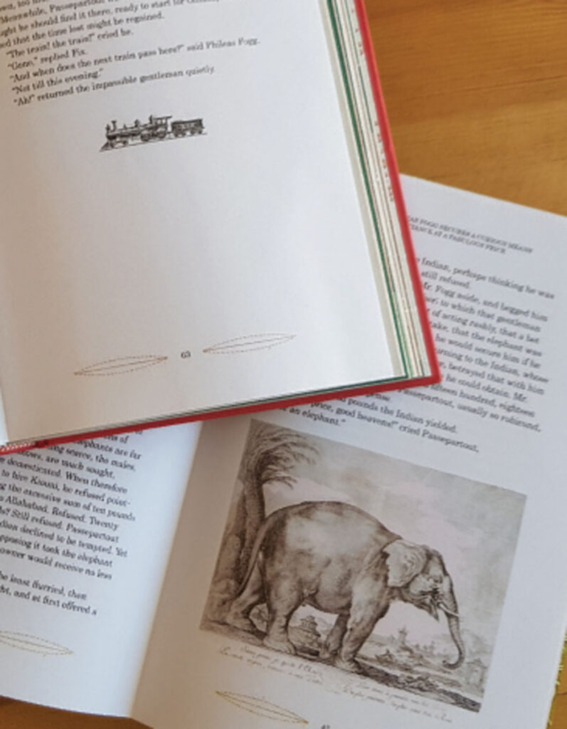
Innovative print techniques and trends of the 19th century, such as chromolithography, the rise of hand-drawn fonts and ornamental typography styles, and the influence of exotic cultures, inspired and informed the final product. It incorporates a collection of beautiful original images and printed ephemera related to the novel’s themes of travel and transportation.
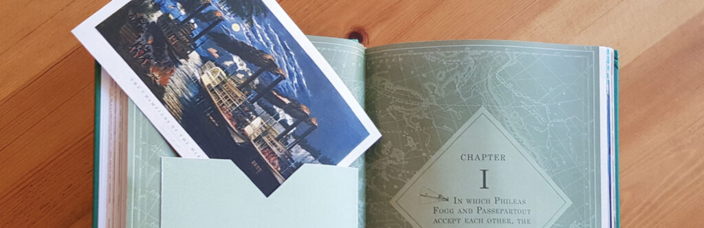
The designed outcome is an interactive collector’s edition book, that expands the reading experience and immerses the audience through paper engineering techniques, vintage imagery, and collectible inserts like postcards, cigarette cards, and maps.
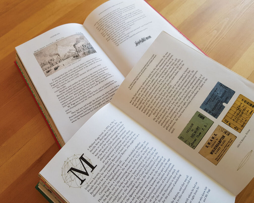
To bring this vision to life, I applied carefully considered editorial design principles, print production methods, and paper mechanisms. I hand-lettered a cover inspired by 19th century typography and designed a fully illustrated interior featuring relevant archival images.
Simple yet impactful interactive elements like folds and spinning wheels promote engagement. By incorporating antique visuals, replicated ephemera, and hands-on features, I aimed to craft an immersive literary experience appealing to readers who are passionate about classic adventure tales, retro design aesthetics, and collectible editions with gamified experiences.
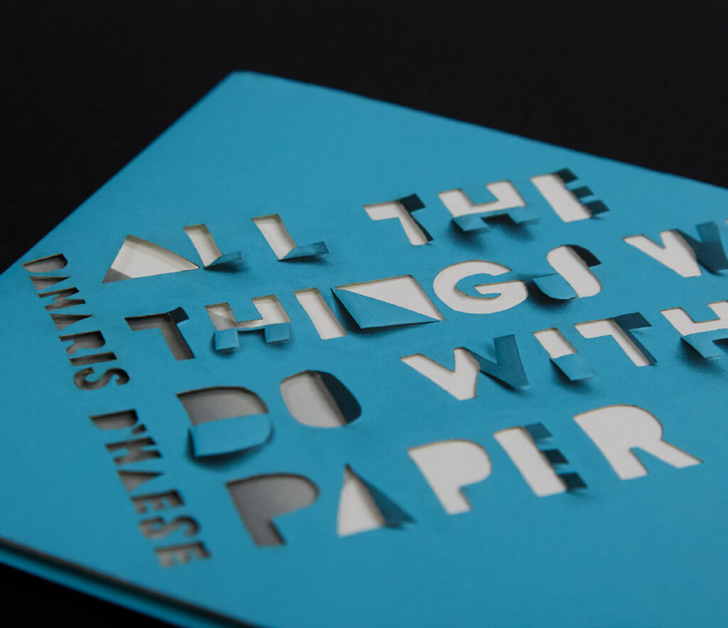
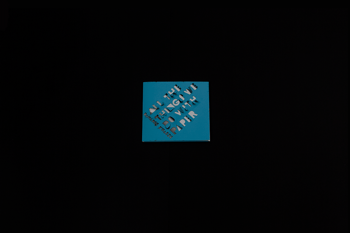
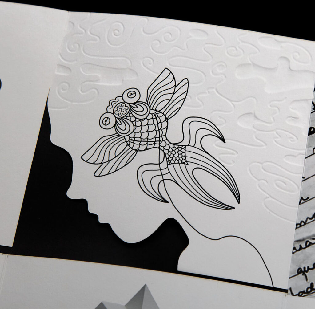
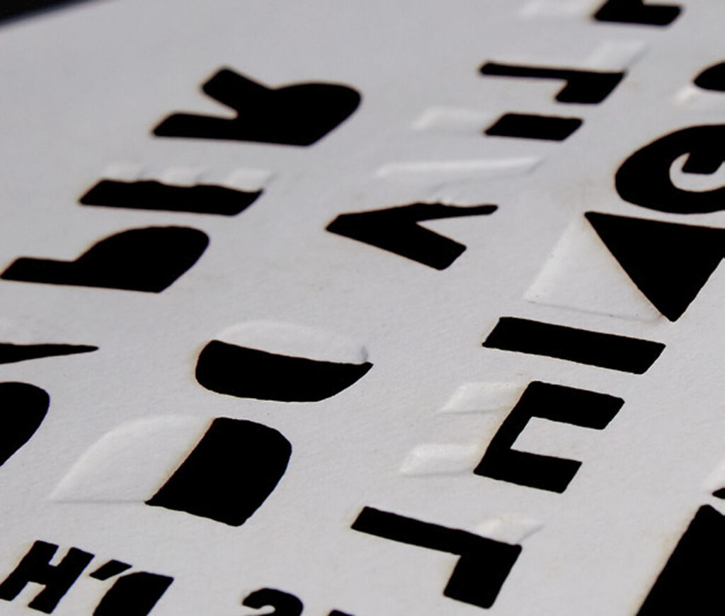
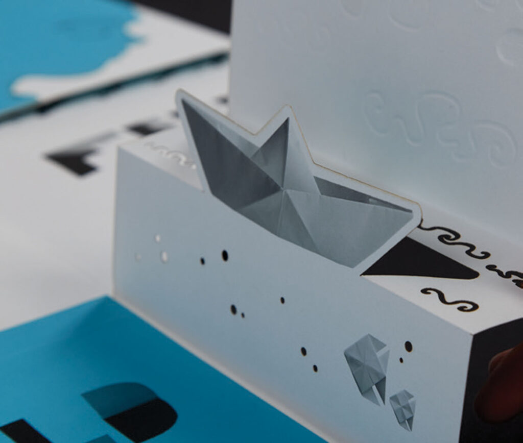
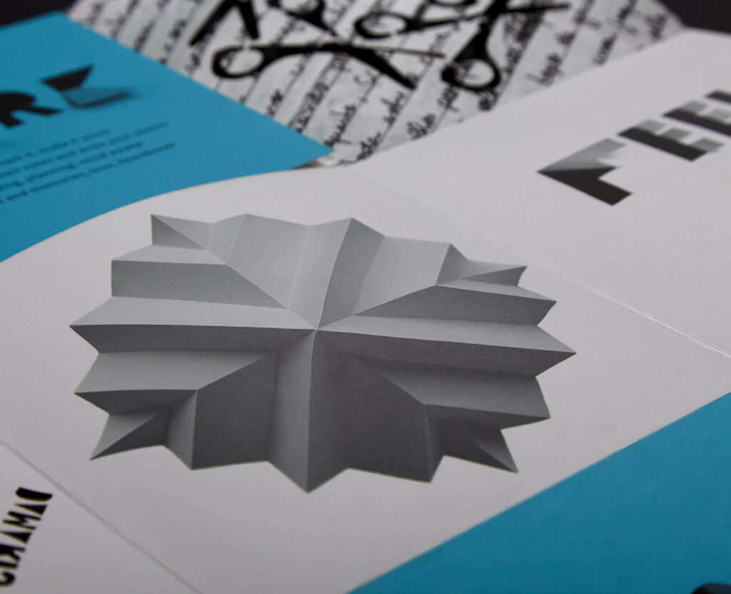
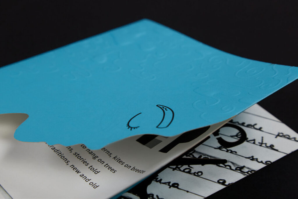
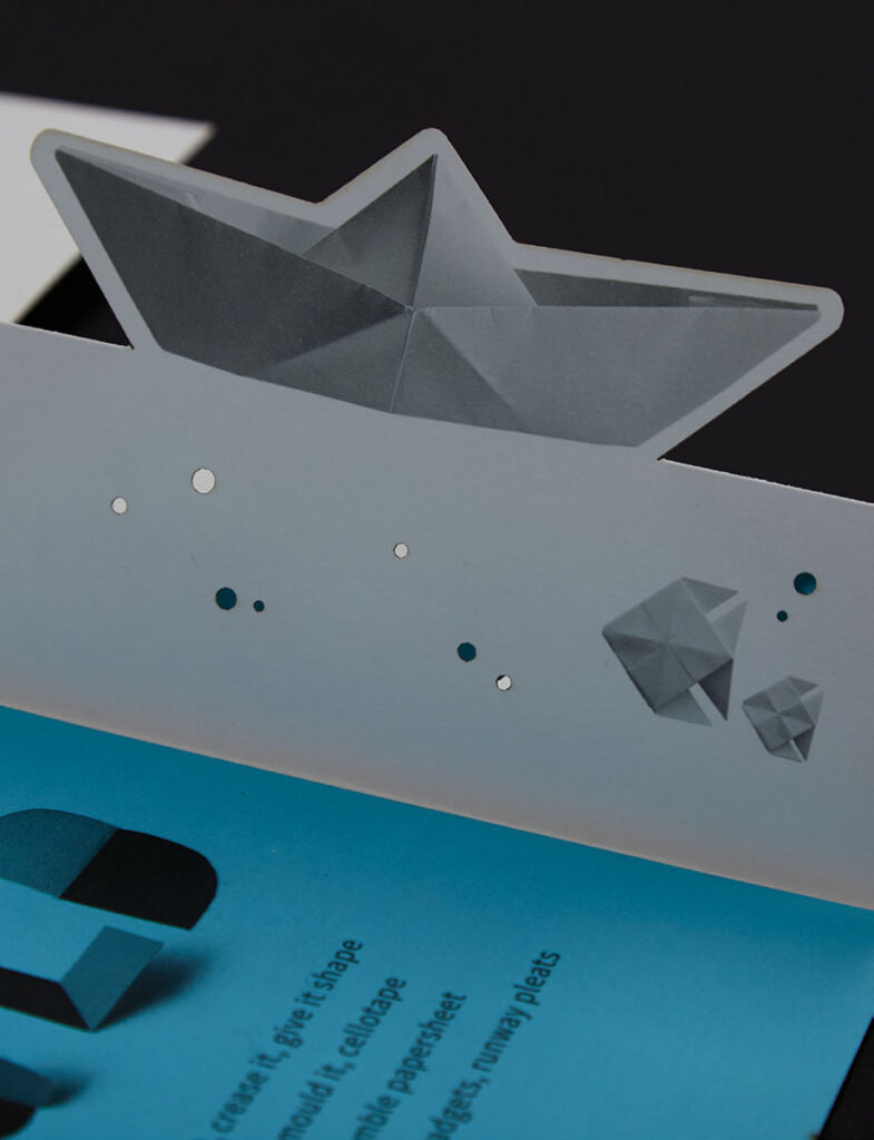
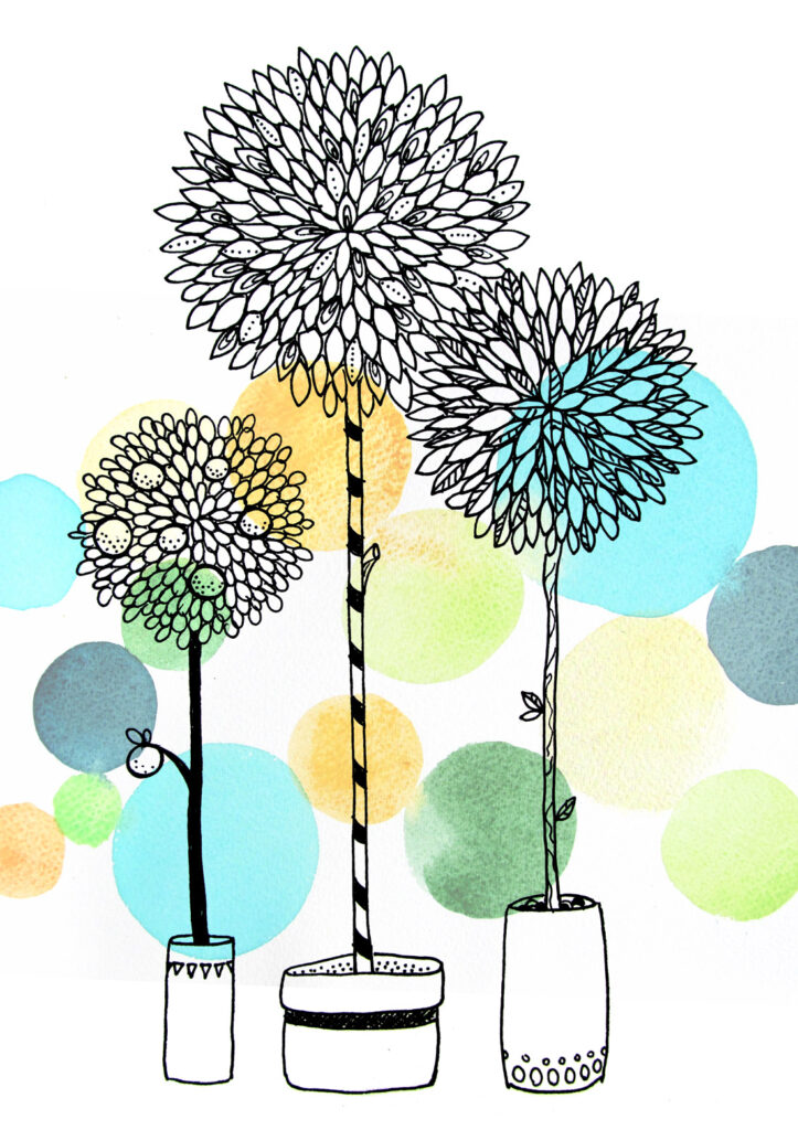
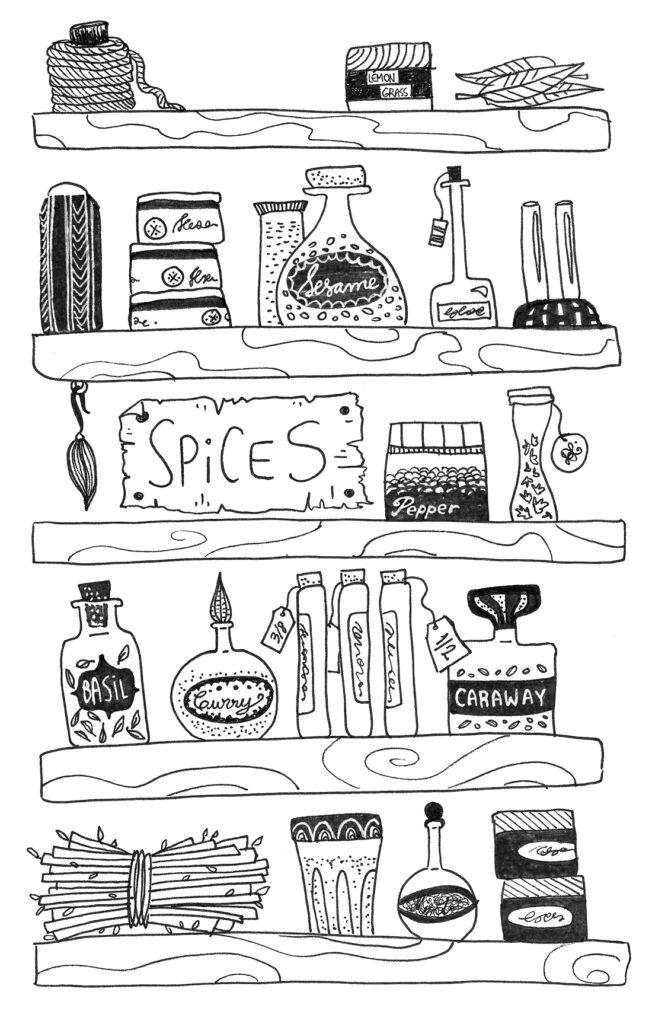
This delightfully unconventional booklet immerses readers in a multisensory exploration of our enduring love affair with paper. It invites interaction through a series of clever cuts, folds, and pop-ups that transform flat pages, and engage the senses with textured embossed illustrations and visual surprises throughout. It’s a whimsical reminder that this simplest of materials is a never-ending spring of creativity and wonder, promoting self-expression and bringing communities together.
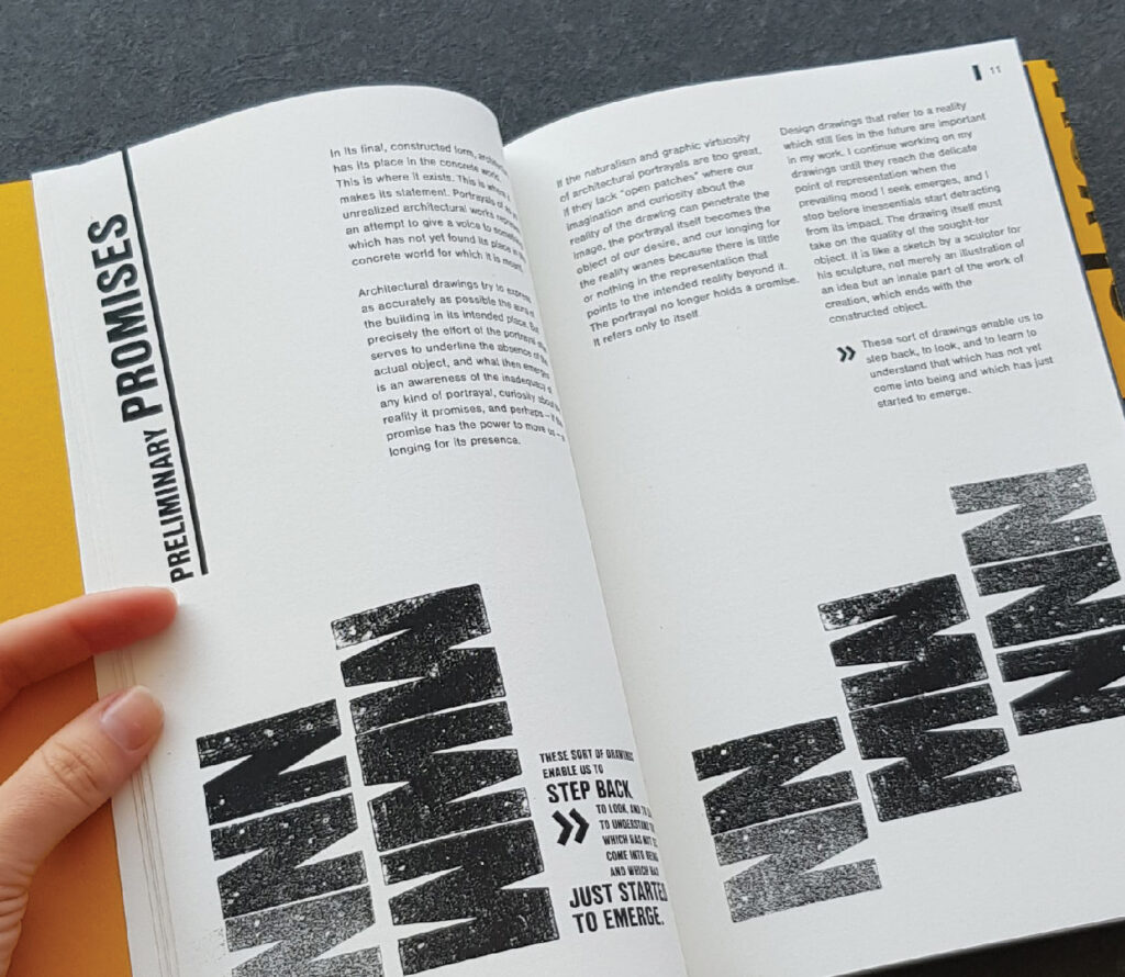
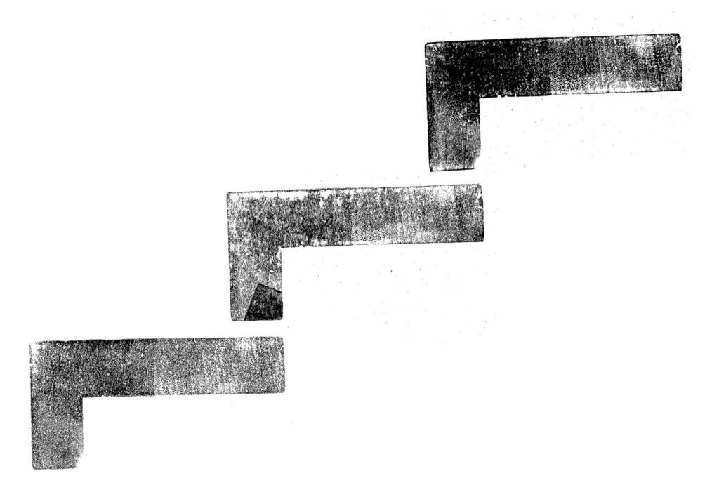
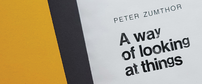
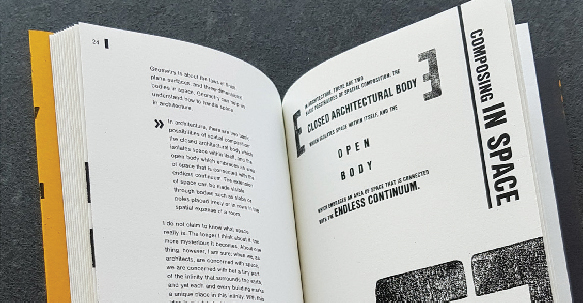
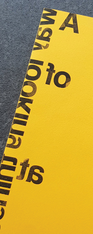
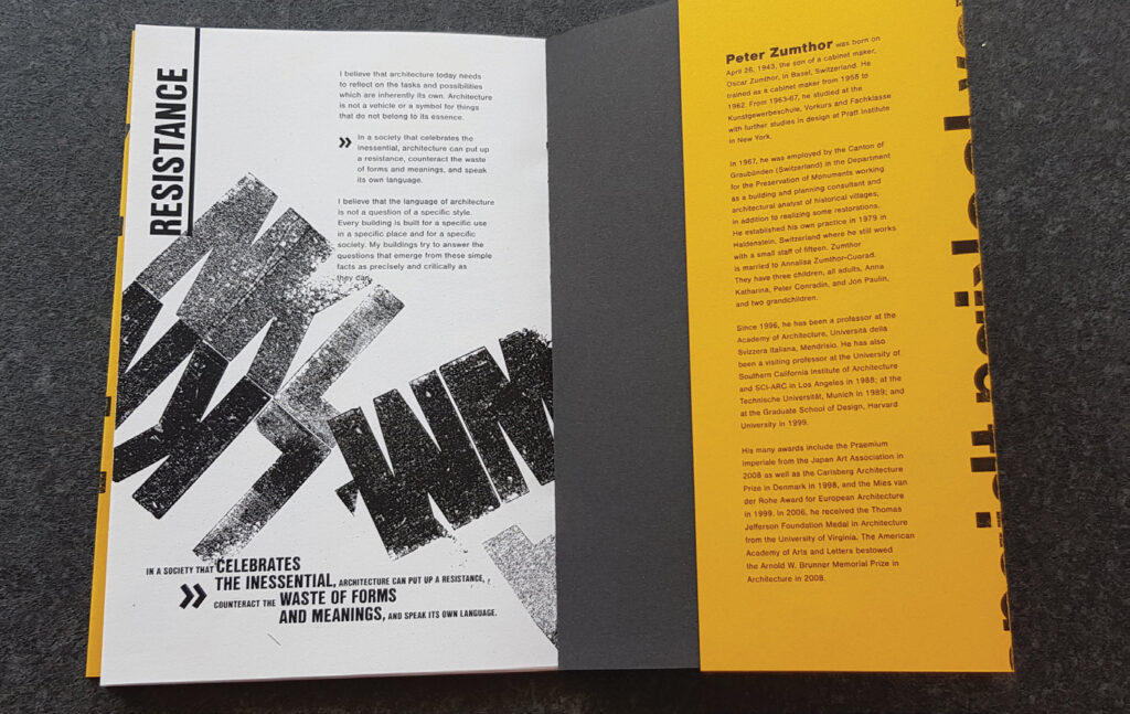
This book’s design pays tribute to the minimalist elegance and craftsmanship of Swiss architecture through letterpress printing techniques. As readers explore the pages within, they are met with typographical explorations of the iconic font Helvetica, which illustrate the content of each article in creative ways.
Through talks and photographs, this passionate Pet Mum told me all about her furry friends’ unique quicks and personality traits. These were then carefully and lovingly translated into a very special Pet Portrait set!
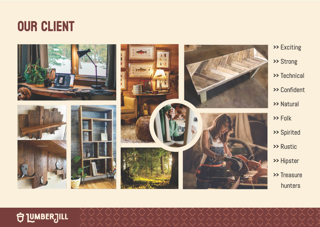
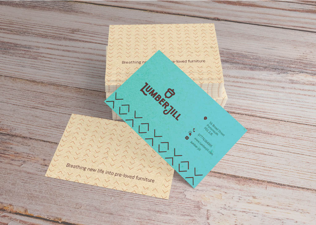
This brand and visual identity were created for a collective of female artists that renew and transform pre-loved furniture. With a strong entrepreneurial spirit, they have formed a group of likeminded people to transform their passion into a business. In a team of three designers, we’ve created a brand that reflects the collective’s love for DIY and power tools, with a personality that is Strong and Rustic. We’ve named the business LumberJill, a choice that embodies the client’s personality and adds a playful gender twist on an activity that might be seen as traditionally more associated with men than women.
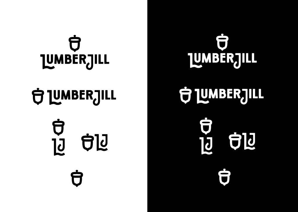
The visual language is bold and strong while maintaining a hint of softness and playfulness to it as well, and presenting a charming retro feel. This is translated to the logomark, which features an all caps sans-serif font, subtly rounded block letterforms, individually customized. As a symbol of renewal and sustainability, the acorn was chosen, representing the planting of seeds for a better future. Derived from the oak tree, it signifies strength, power, and endurance, while also symbolizing the wood material used in the collective’s upcycled furniture pieces.
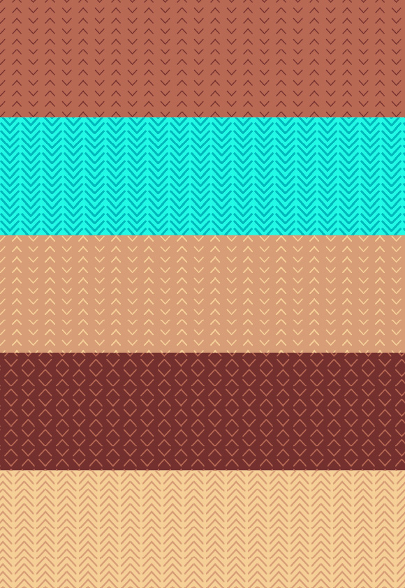
A palette of warm shades of brown was selected to evoke a cosy, welcoming feeling, resonating with the natural essence of wood. This was balanced with a vibrant teal colour, adding personality and a contemporary flair to the brand’s visual identity.
We sought to enhance the brand’s visual identity by introducing brand patterns that encapsulate its essence. Inspired by traditional folk art, which harmonizes with the Lumberjack theme and woodland cabin ambiance, we incorporated a chevron arrow shape as a supporting graphic element. This shape echoes the rugged charm of outdoor hiking trails, also suggesting movement and energy, complementing the brand’s personality.
Variations of the logo were also developed, ensuring consistent brand application across media of various shapes and sizes, as well as black and white scenarios.
Given its potential for success on Instagram, an ideal platform to promote artists and creative businesses, we recommended establishing the brand’s main online presence through an Instagram account. The feed would feature a variety of content, including photos of finished products, work-in-progress posts and stories, tutorials, and lifestyle content reflecting the members of the collective and their creative journeys. Additionally, Instagram would serve as an ideal platform for promoting events and workshops, allowing the brand to engage with its audience in a dynamic and interactive way.
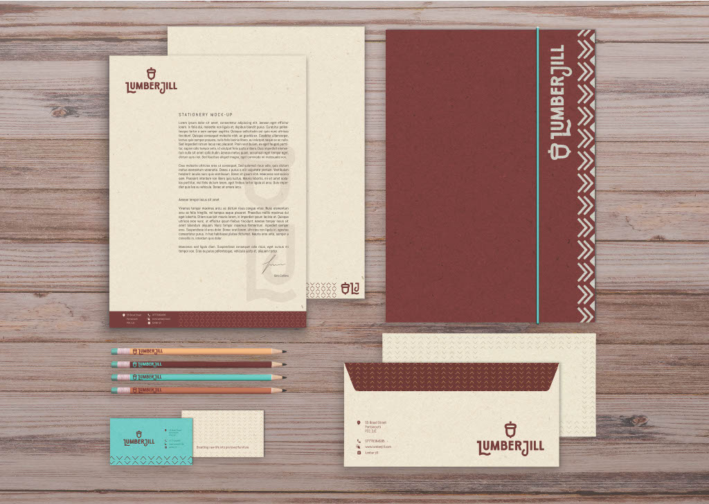
For the stationery, we opted for recycled paper, whose color and texture enhance the rustic ambiance of the brand while promoting sustainability, a core value. To maintain cost-effectiveness without sacrificing quality and visual impact, a single spot color was applied to the letterhead, envelopes, and folder. For the business card, two spot colors were utilized to ensure the vibrant teal, important for making a strong impact in this instance. The brand patterns and typography are used to support the visual language of the business, with contact details at hand where appropriate.
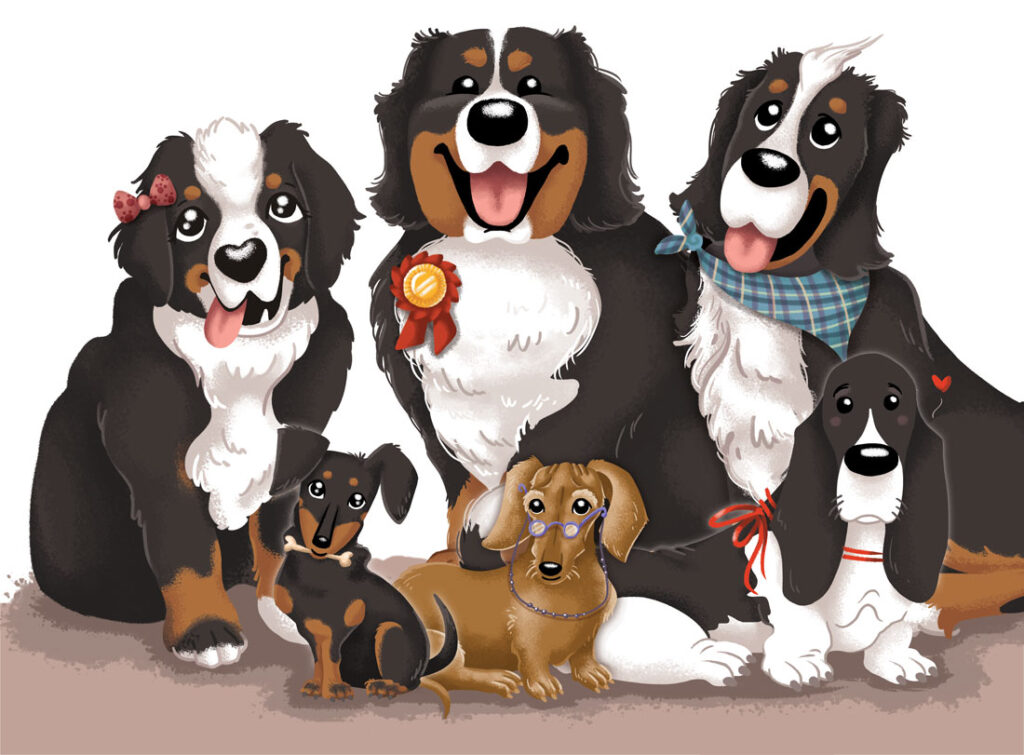
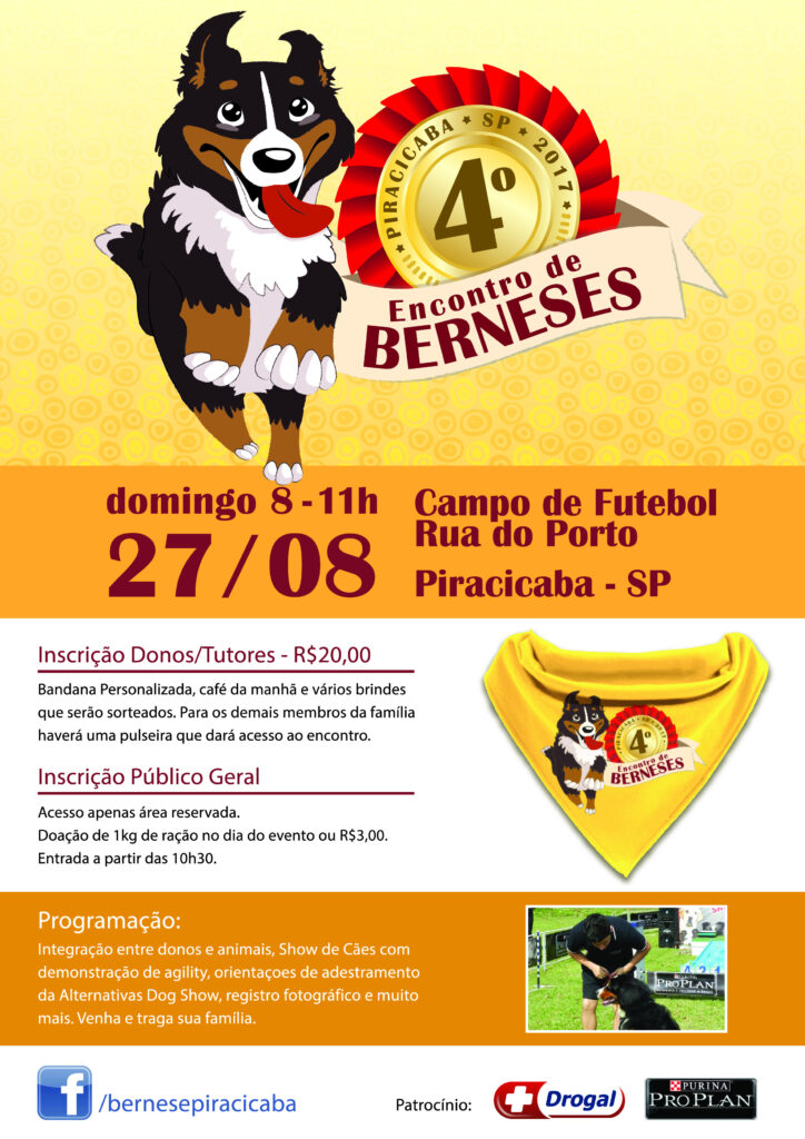
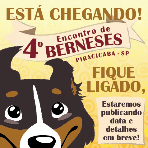
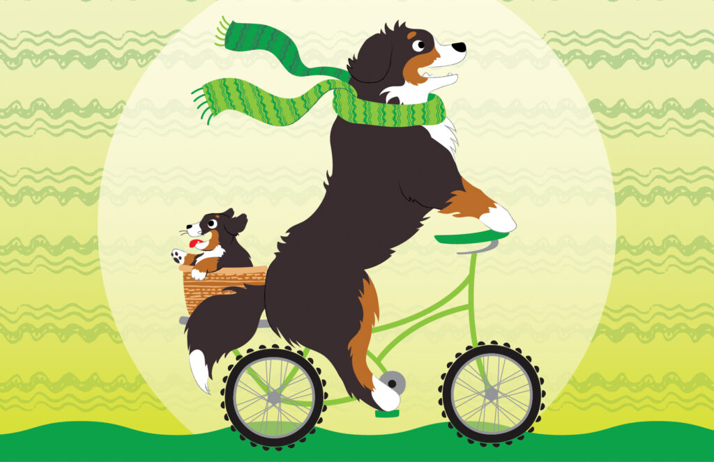
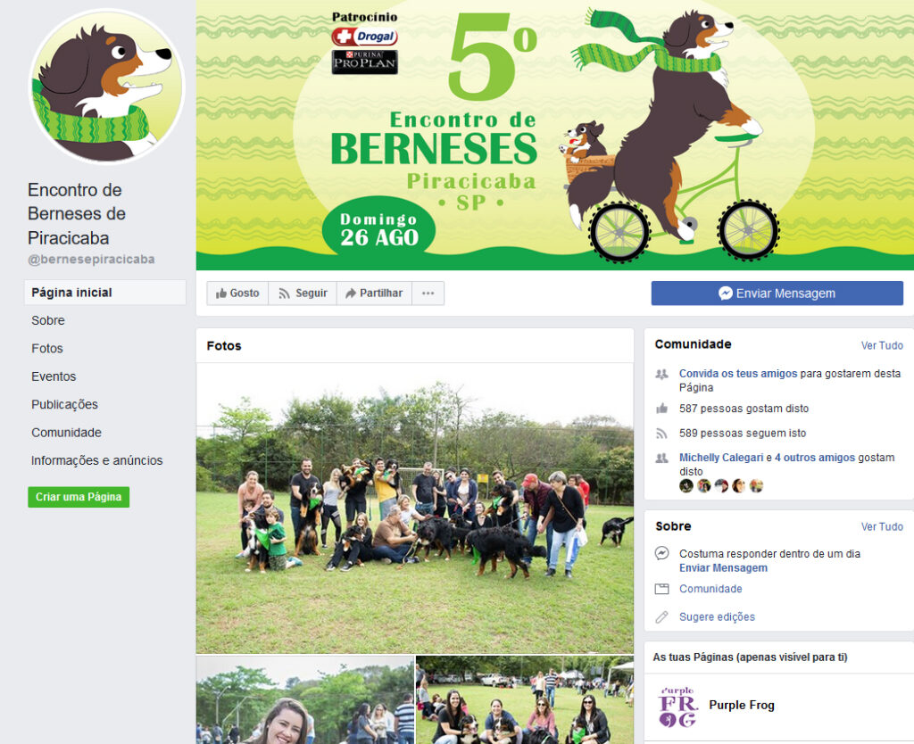
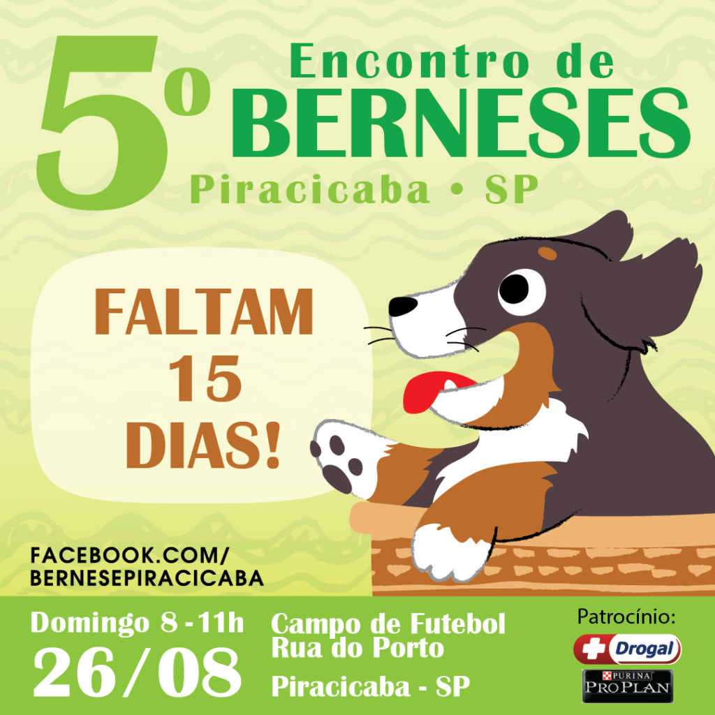
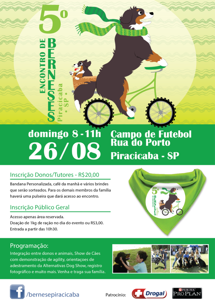
I’ve had the pleasure of designing promotional materials for an enthusiastic hobbyist group of Bernese Mountain Dog owners and breeders. This dedicated community gathers annually to celebrate their shared passion, exchanging insights, tips, and stories. I’ve helped promote their gatherings with posters, t-shirts, social media campaigns and other graphic materials.
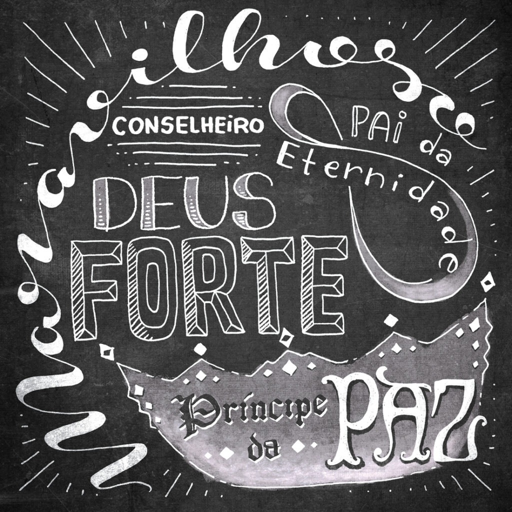
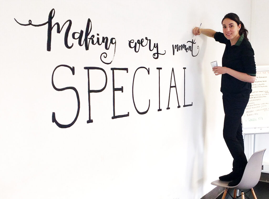
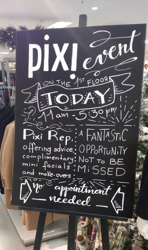
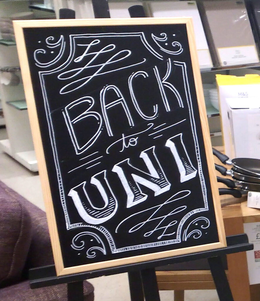
Hand-lettering adds a bespoke and human touch to businesses and events. With this technique I have created black-boards, signage, murals and customized wall-art pieces.
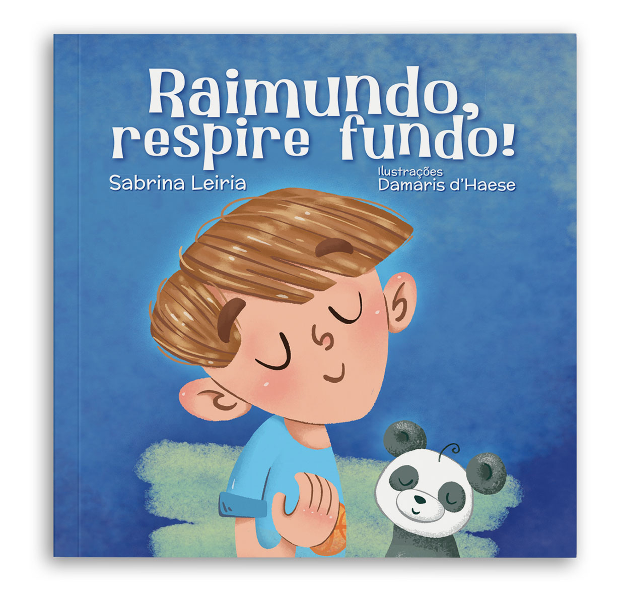
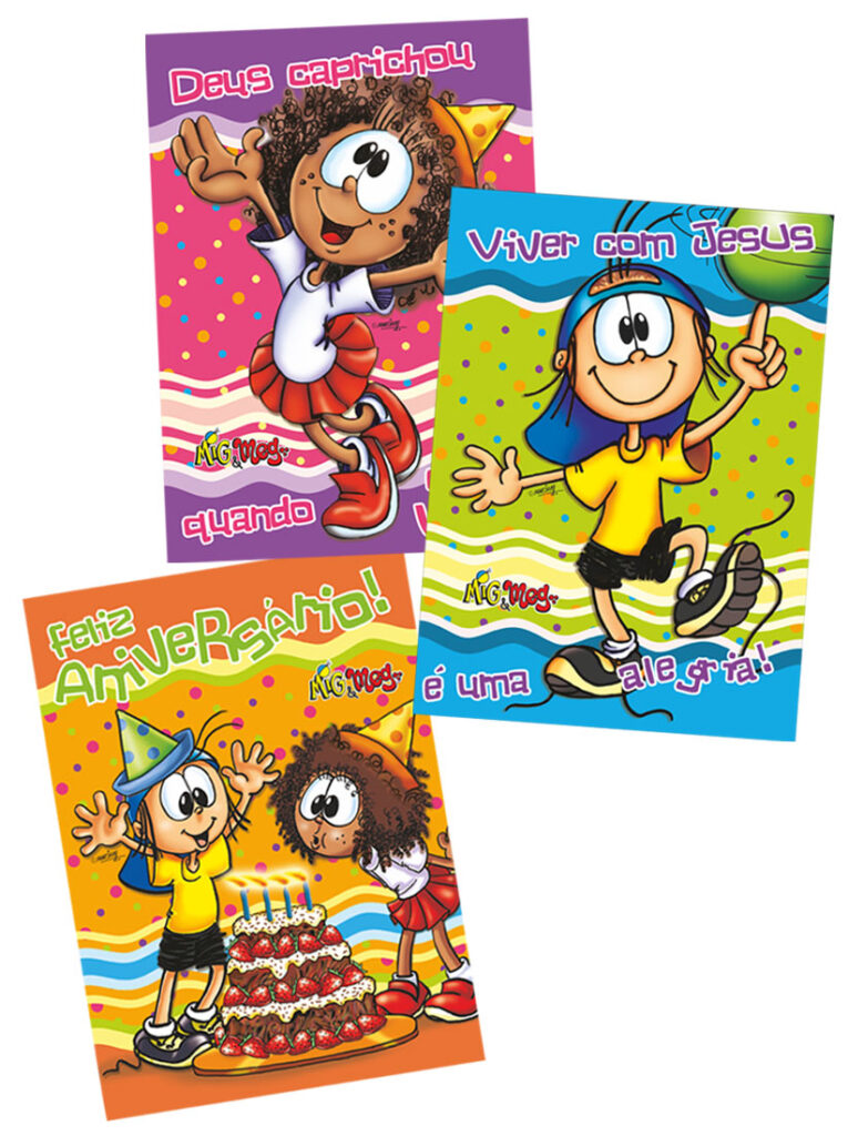
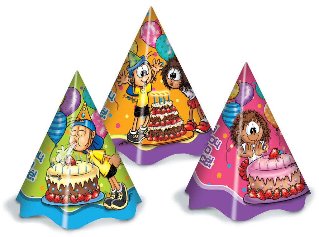
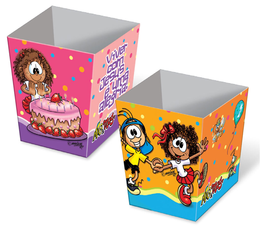
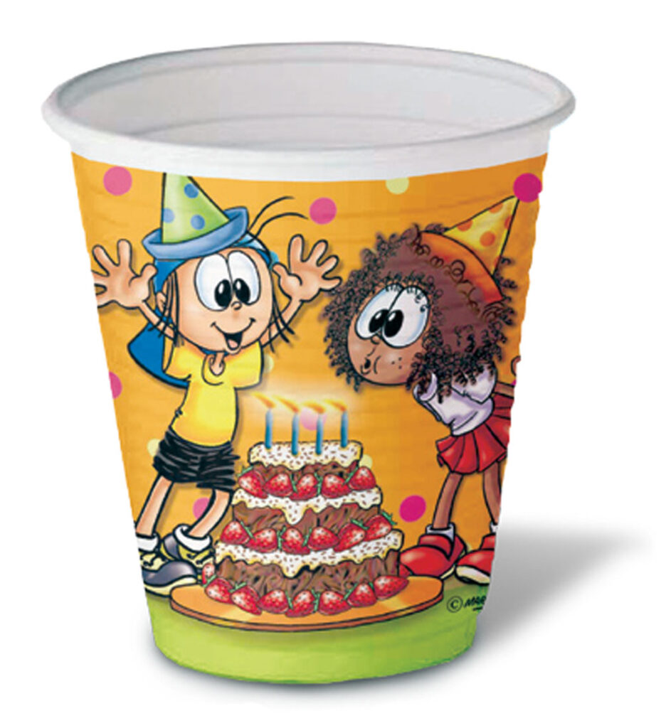
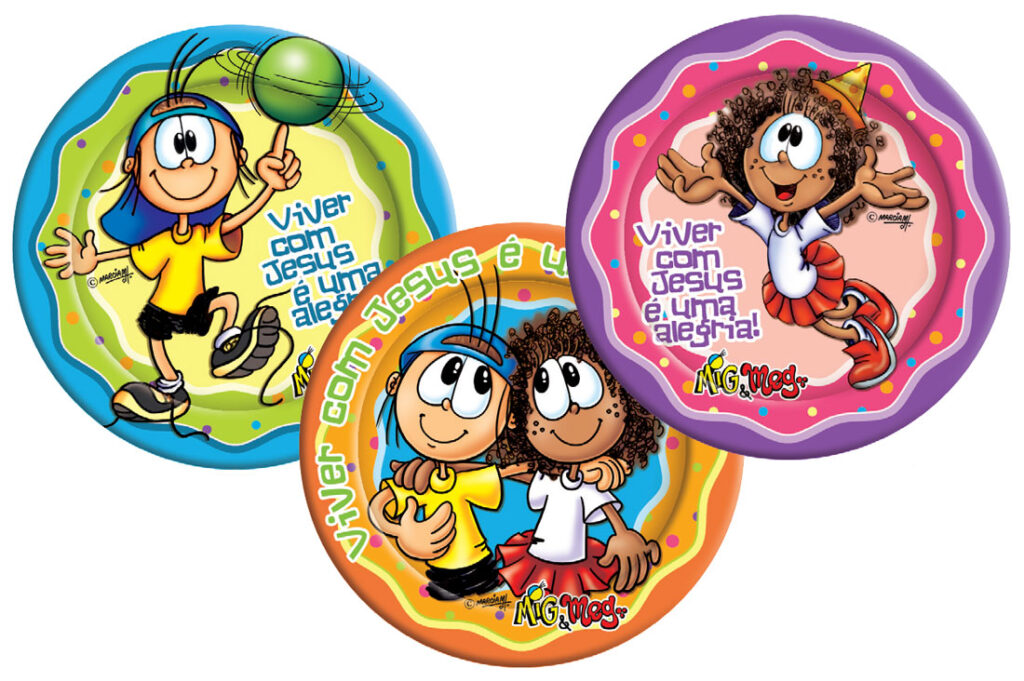
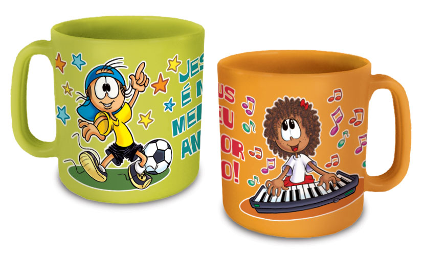
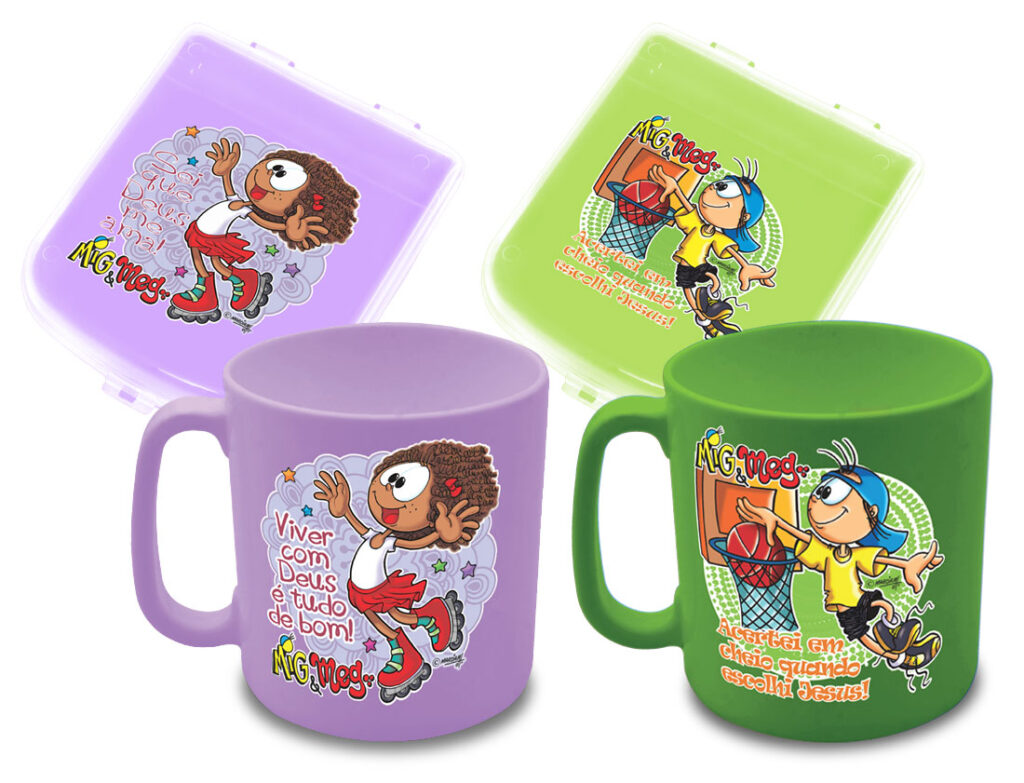
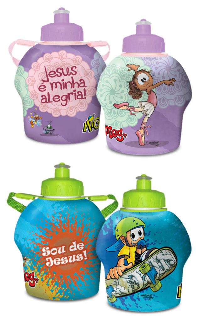
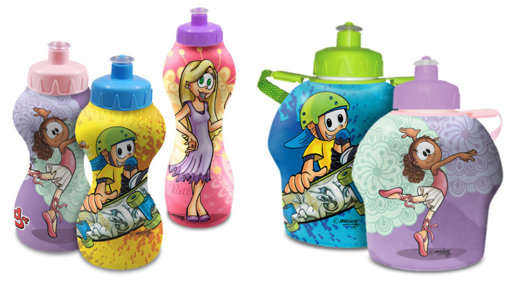
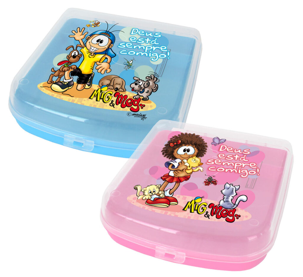
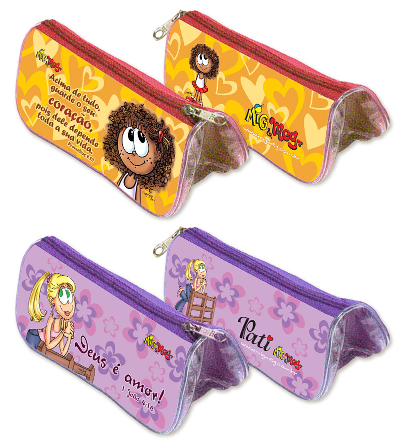
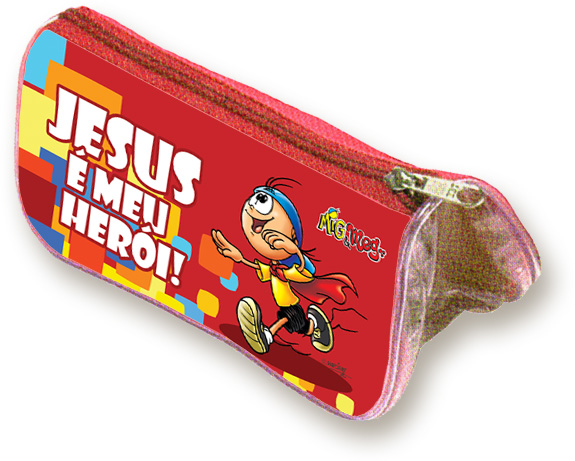
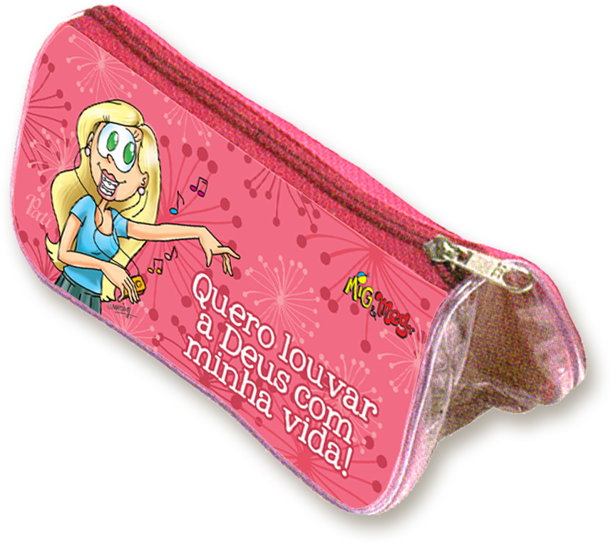
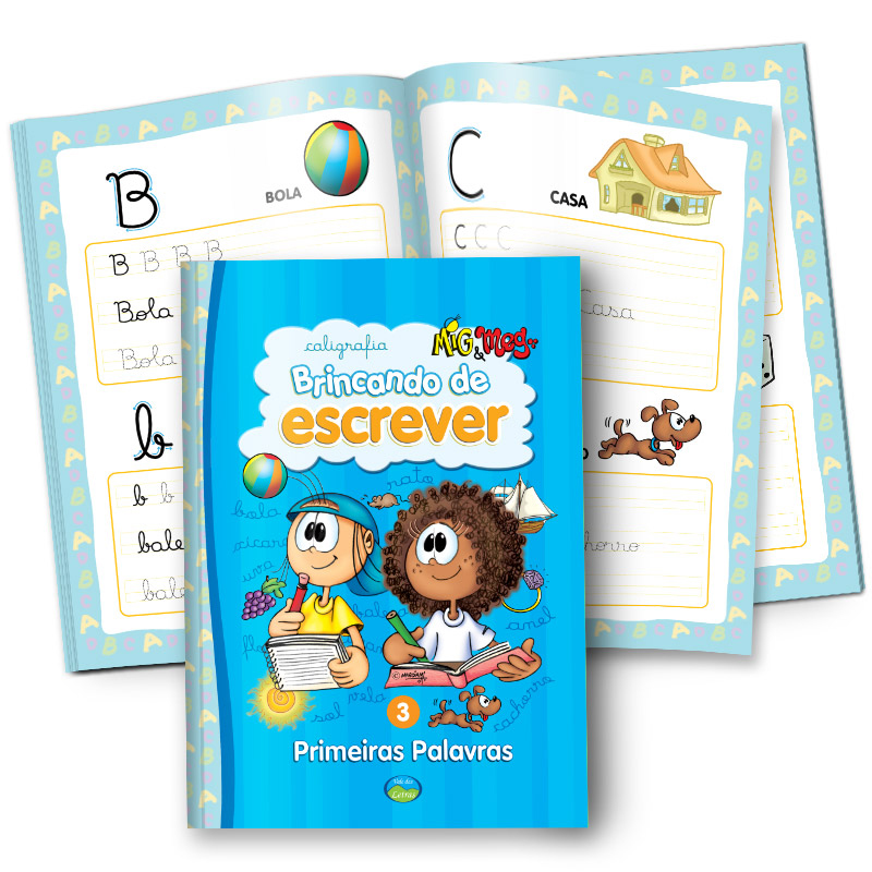
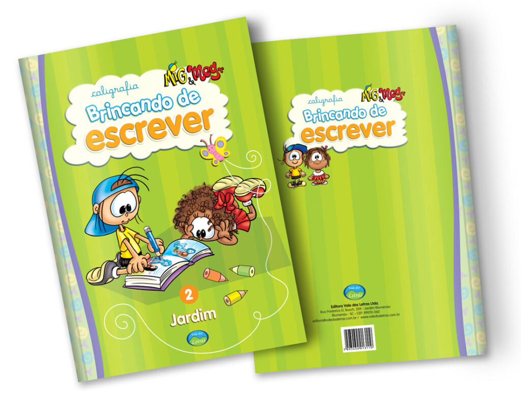
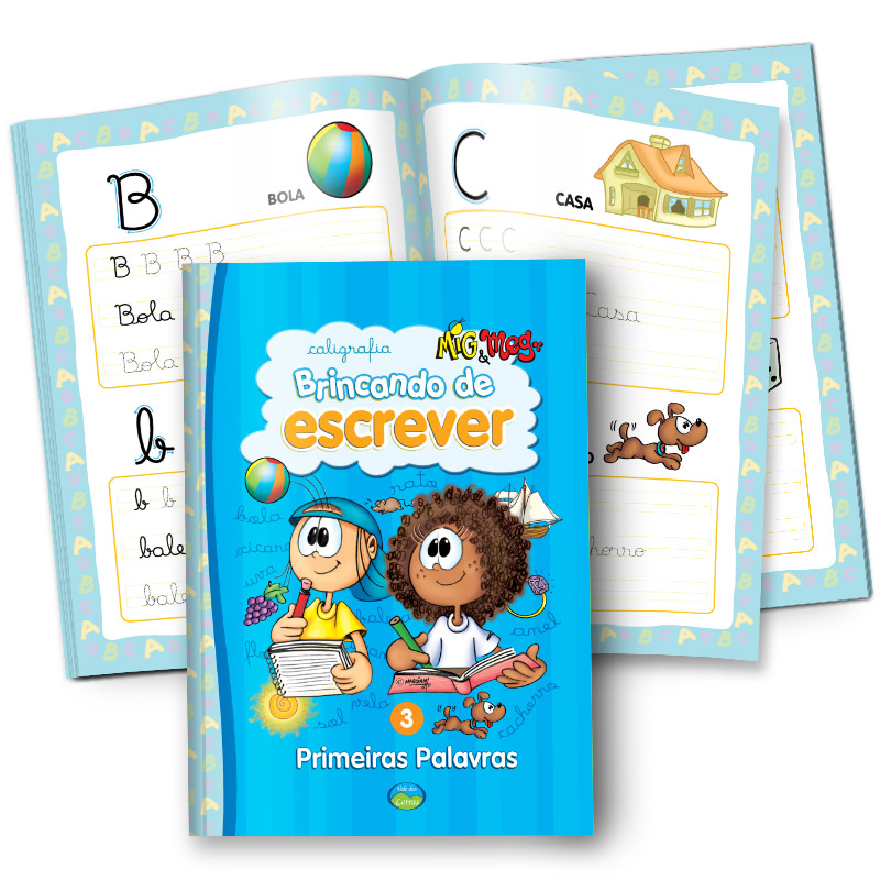
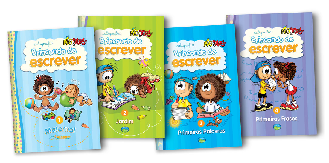
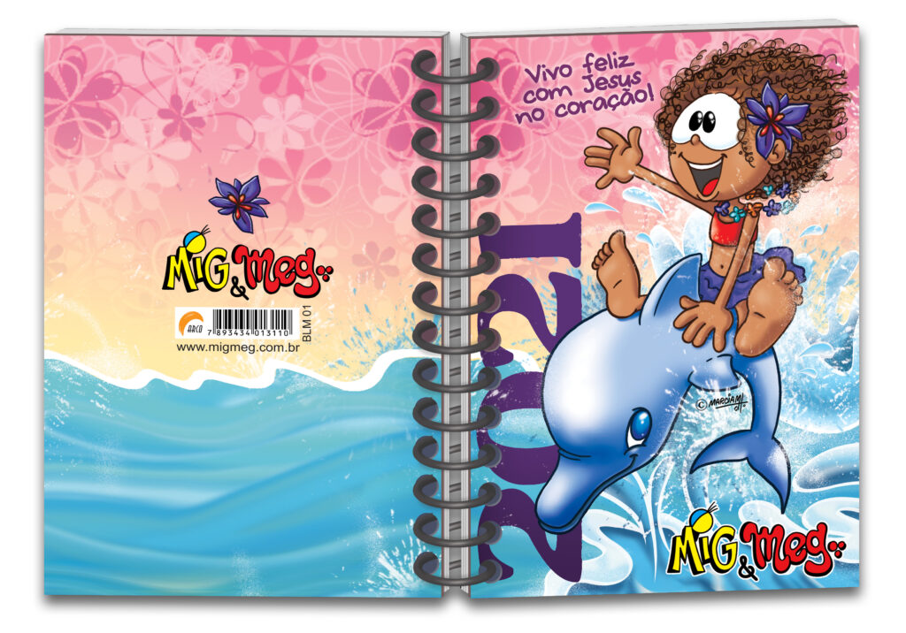
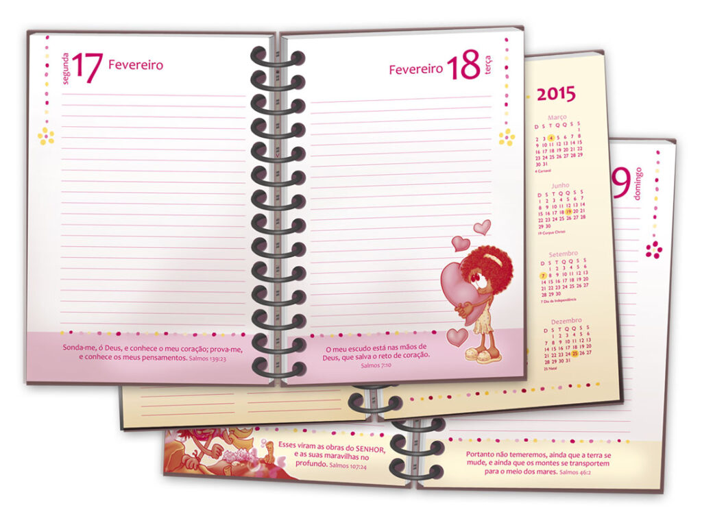
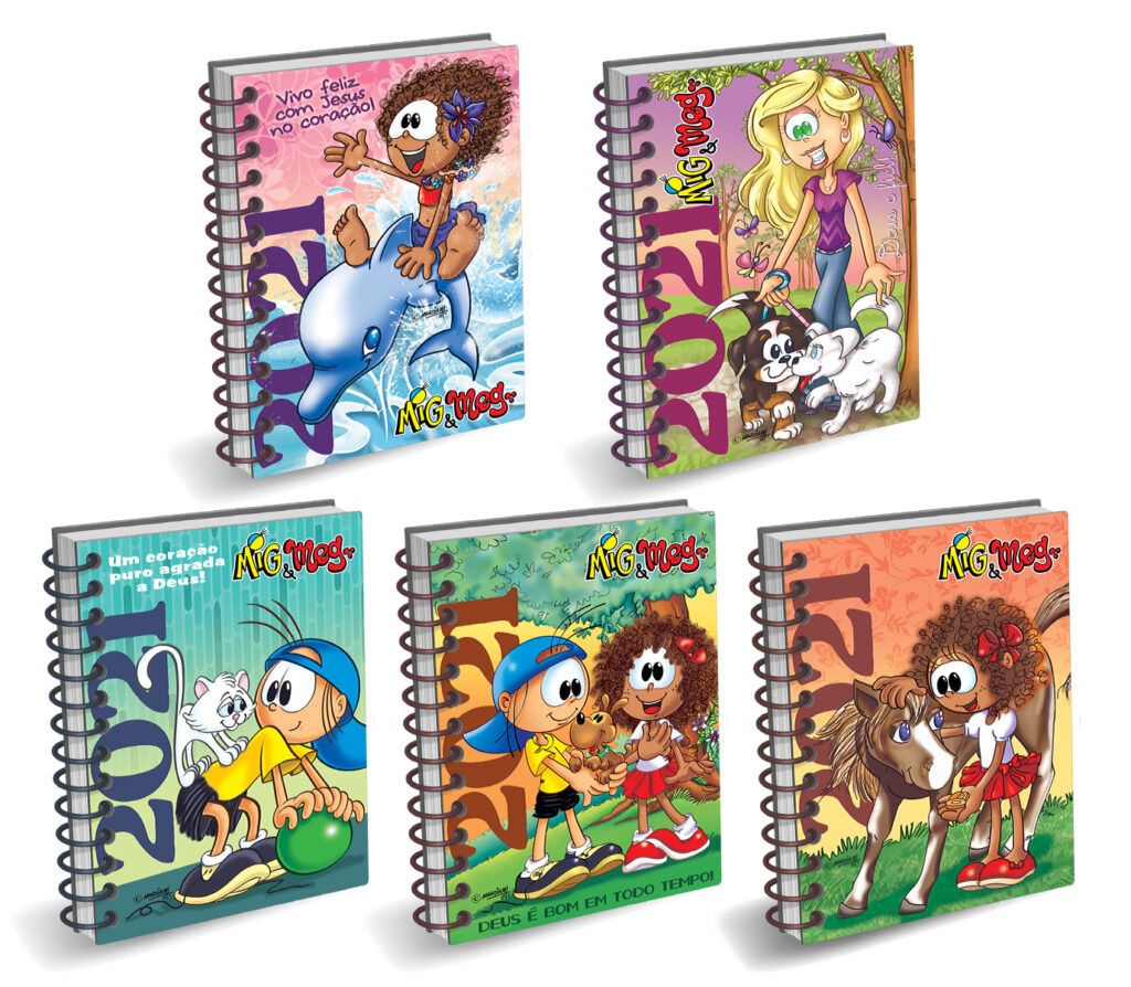
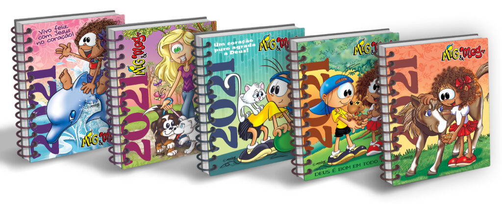
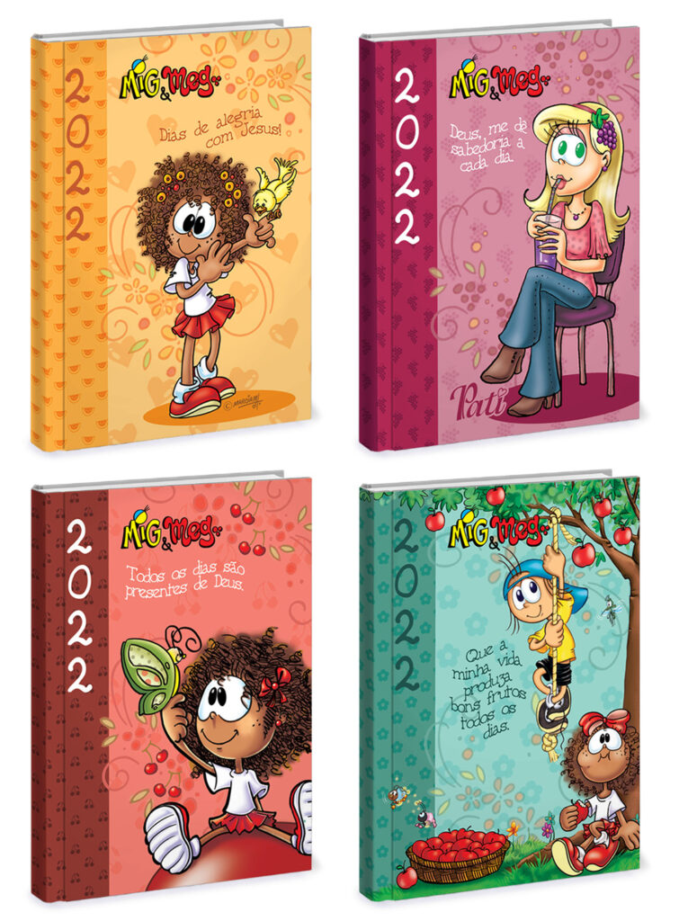
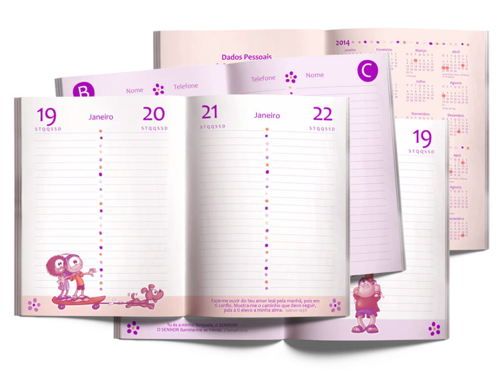
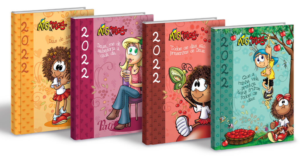
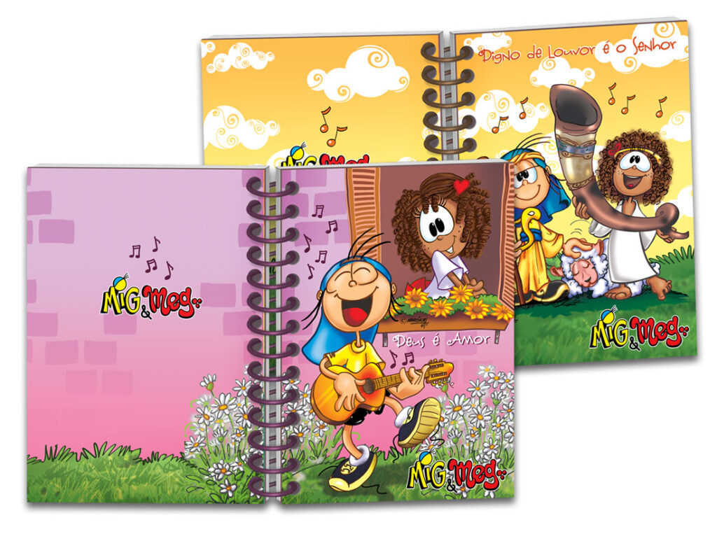
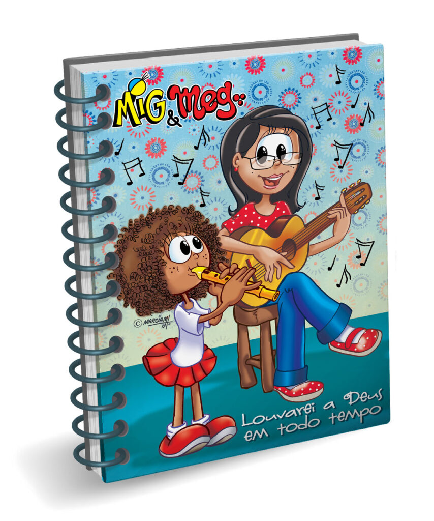
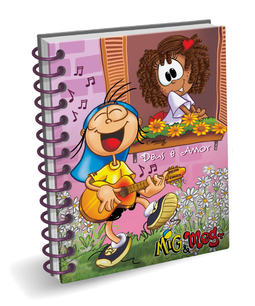
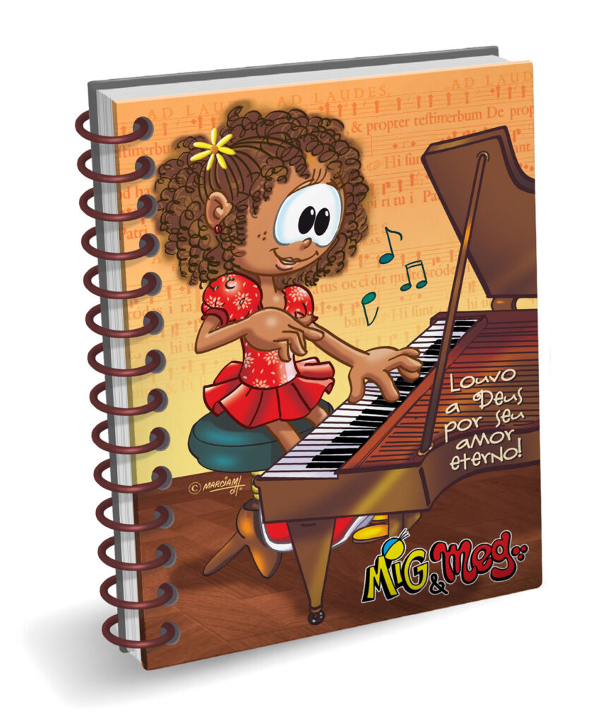
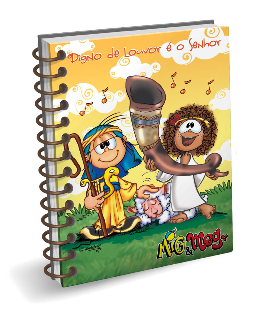
I’ve had the privilege of contributing graphic design work to the beloved characters Mig&Meg and friends, created by the illustrator Marcia d’Haese, esteemed and renowned across Brazil.
Through our company’s licensing agreements, these cherished characters have found their way onto an extensive array of products. From greeting cards to stationary, comic books to children’s literature, apparel to household utensils, and even party decorations and accessories, Mig&Meg and friends have become an integral part of daily life for many. It’s been an honor to play a role in bringing these characters to life in various forms, enriching the lives of countless fans across the nation.
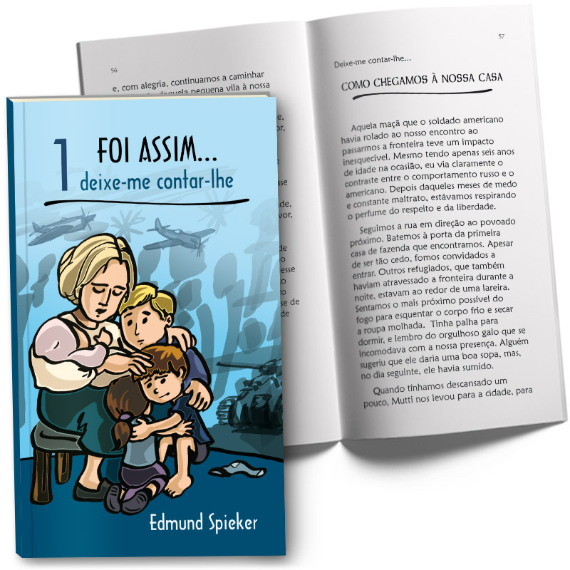
This series of biographical books authored by Edmund Spieker contain powerful narratives detailing his family’s escape from wartime Germany and his subsequent journey in establishing the missionary Radio Trans Mundial in Brazil. Working alongside the talented illustrator Marcia d’Haese, our collaboration aimed to visually enrich Spieker’s remarkable accounts, offering readers an immersive glimpse into his life’s journey of resilience and faith.
I’ve had the privilege of contributing graphic design work to the beloved characters Mig&Meg and friends, created by the illustrator Marcia d’Haese, esteemed and renowned across Brazil.
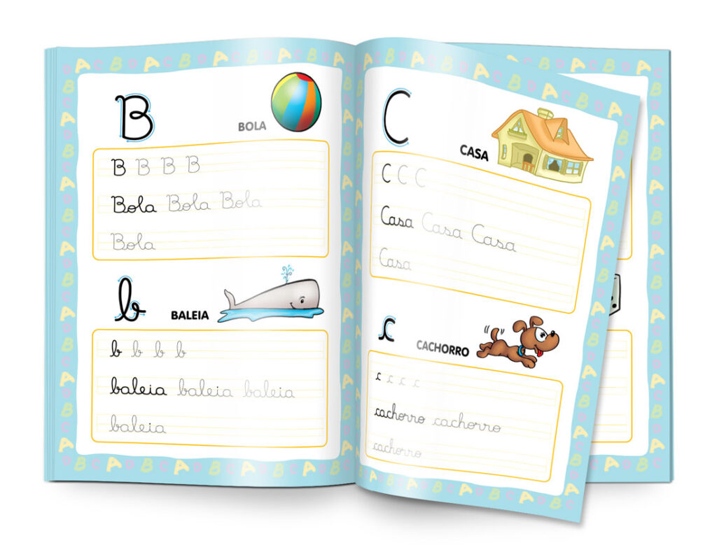
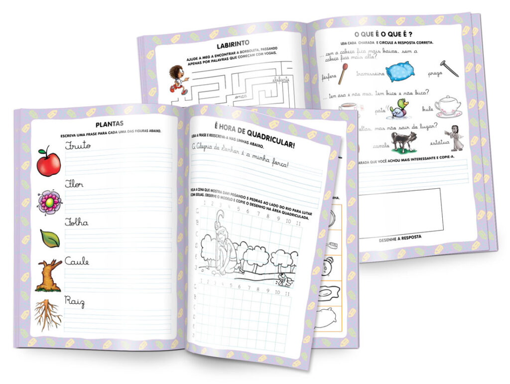
In this collection of educational brochures, the focus was on providing children with a fun and approachable way to learn writing skills, from their earliest attempts to forming their first words and phrases. Using a palette of bright and light colours, the design was crafted to be visually appealing and conducive to a child’s learning environment. Through simple yet engaging illustrations and activities, accompanied by child-friendly typography, the aim is to create an inviting experience that encourages exploration and learning.
I’ve had the privilege of contributing graphic design work to the beloved characters Mig&Meg and friends, created by the illustrator Marcia d’Haese, esteemed and renowned across Brazil. In these collections of notebooks and agendas, we opted for a strategic approach by printing the text block in two spot colours, effectively reducing ink usage and production costs without compromising quality.
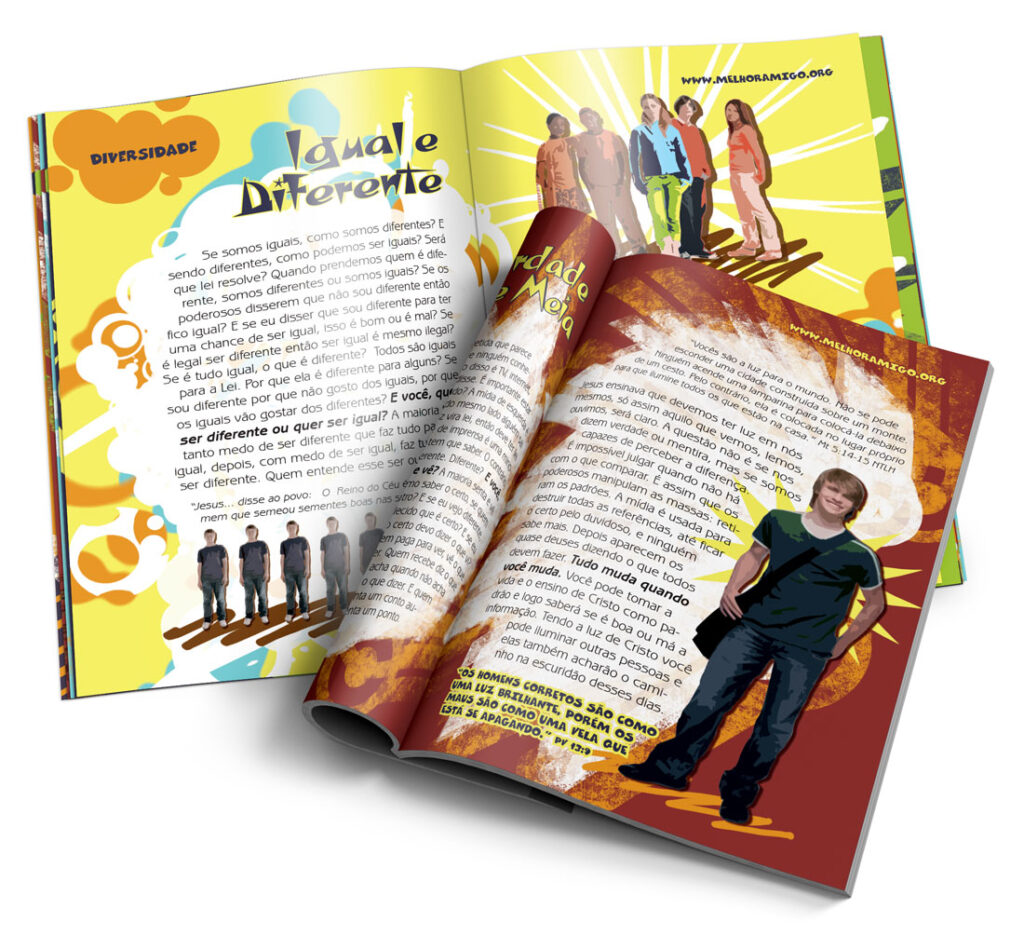
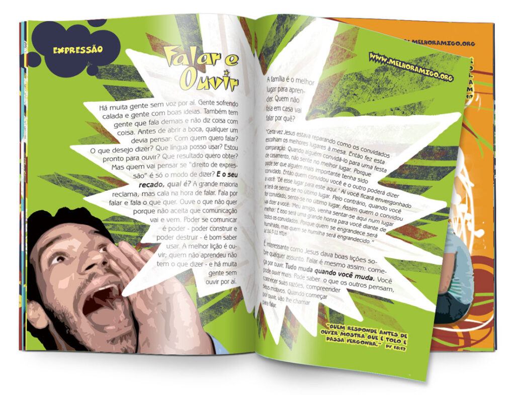
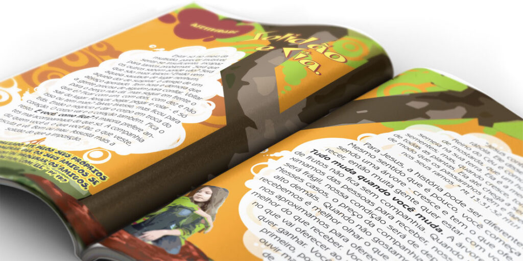
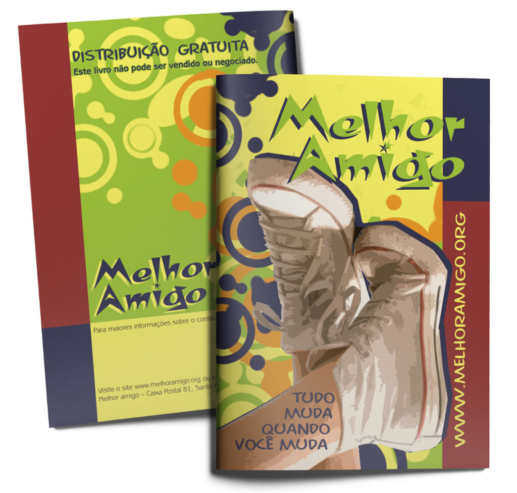
This booklet offers guidance for youth as they navigate the complex journey of adolescence. My visual approach for this project combines digitally manipulated photography with illustration, resulting in a dynamic and captivating aesthetic that resonates with this age group. It was a rewarding experience using my skills towards a resource that promotes the holistic well-being and personal development of young readers, empowering them with resilience and wisdom as they navigate the transitional years of youth.
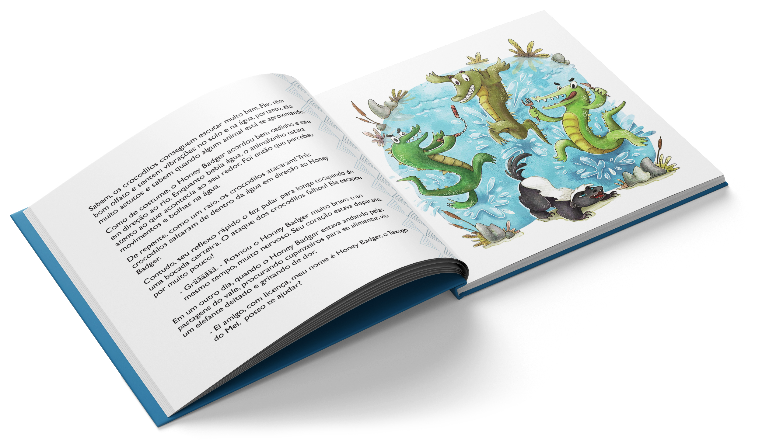
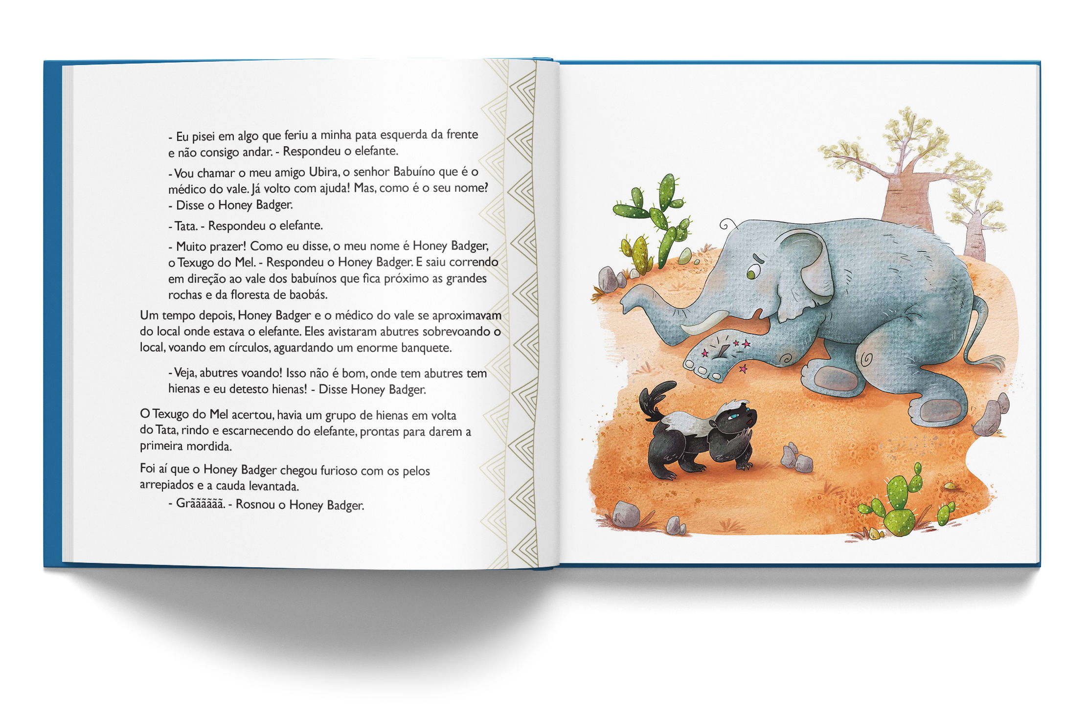
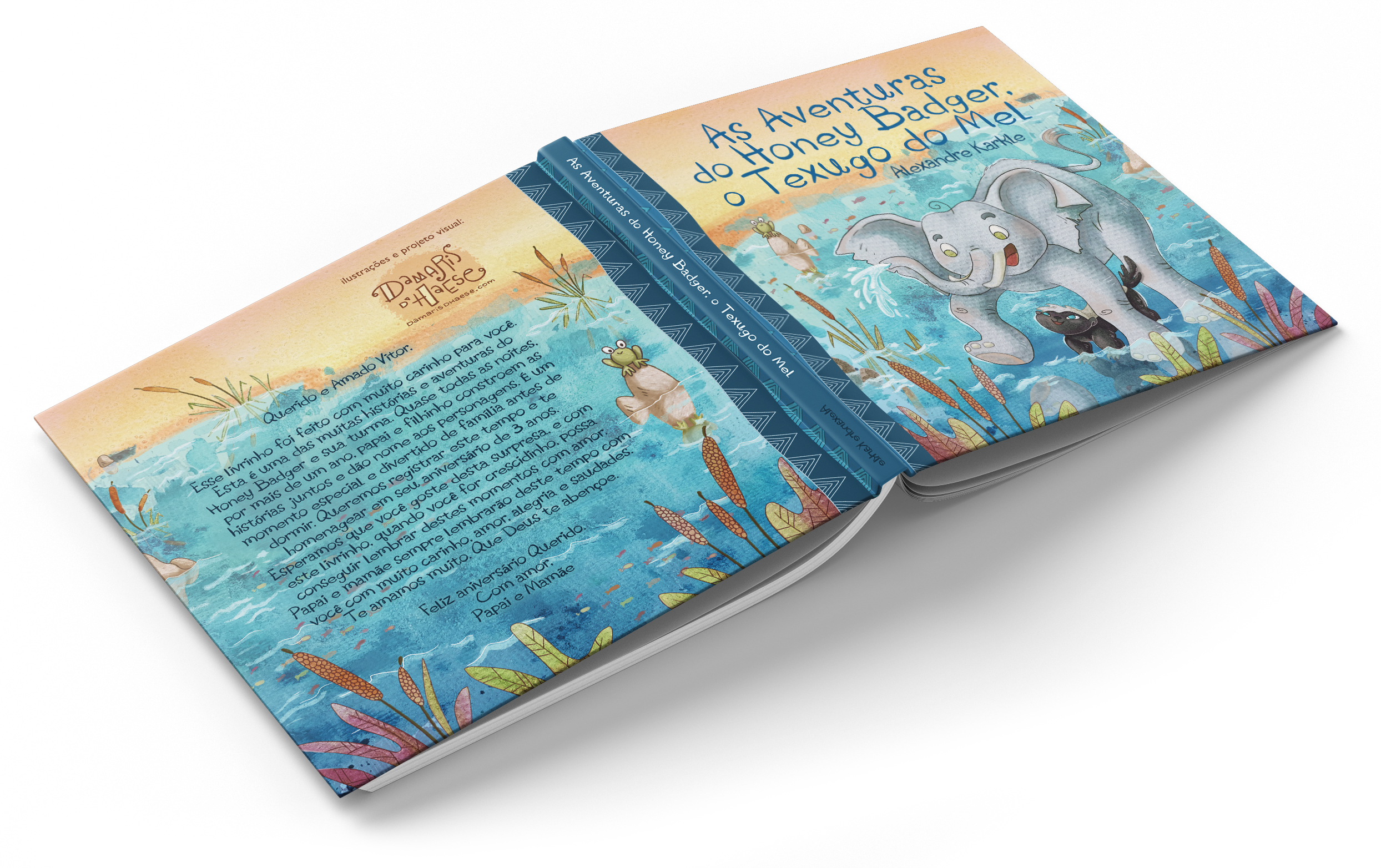
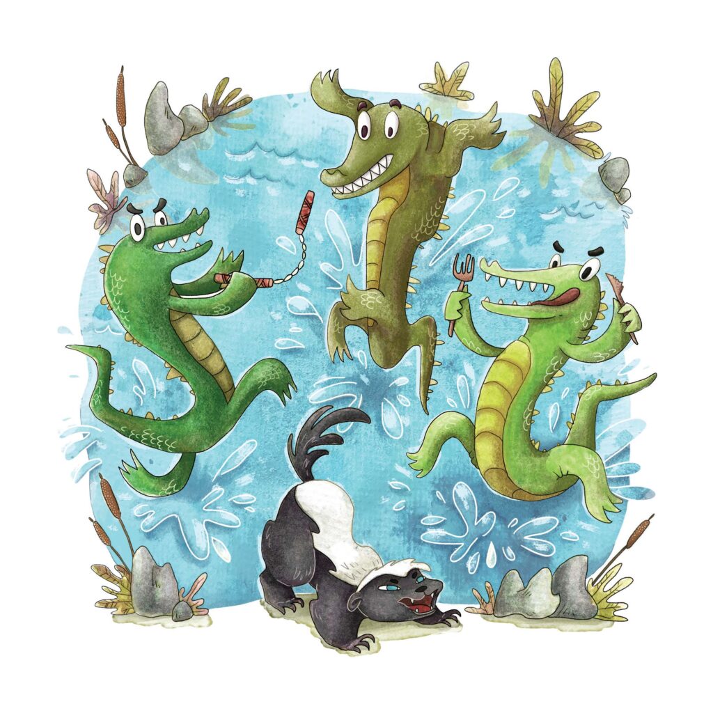
Alexandre Karkle, the writer of this book, is a dedicated father whose passion for honey badgers and love for his son were truly infectious. Drawing inspiration from his heartfelt stories and admiration for these resilient creatures, I set out to translate that passion into watercolour illustrations that would captivate young readers. With each image, I aimed to convey the writer’s excitement and devotion, infusing the pages with the same sense of wonder and adventure he shared with his son. It was a collaborative effort filled with warmth and creativity, resulting in a book about strength and kindness, showing kids that even the smallest creatures can overcome big challenges.
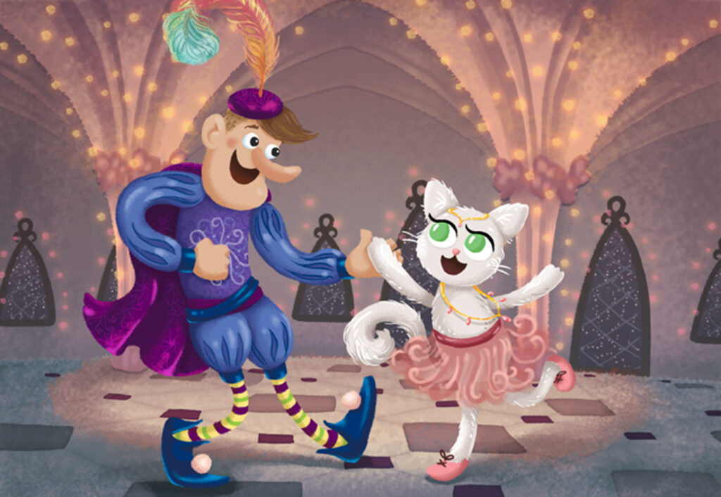
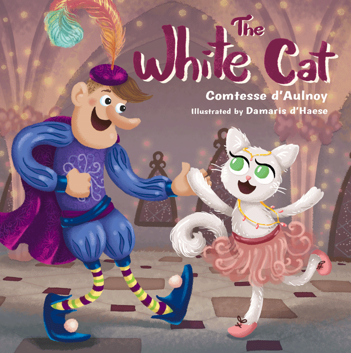
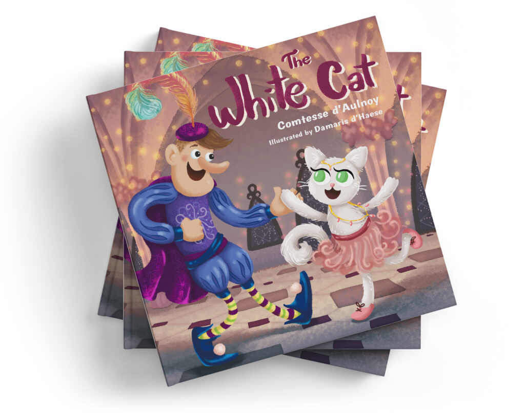
As a student participating in “Create Art That Sells” led by renowned art agent Lilla Rogers, I had the opportunity to illustrate a children’s book titled “The White Cat.” This enchanting story follows the adventures of a prince who encounters a magical feline princess living in a hidden castle.
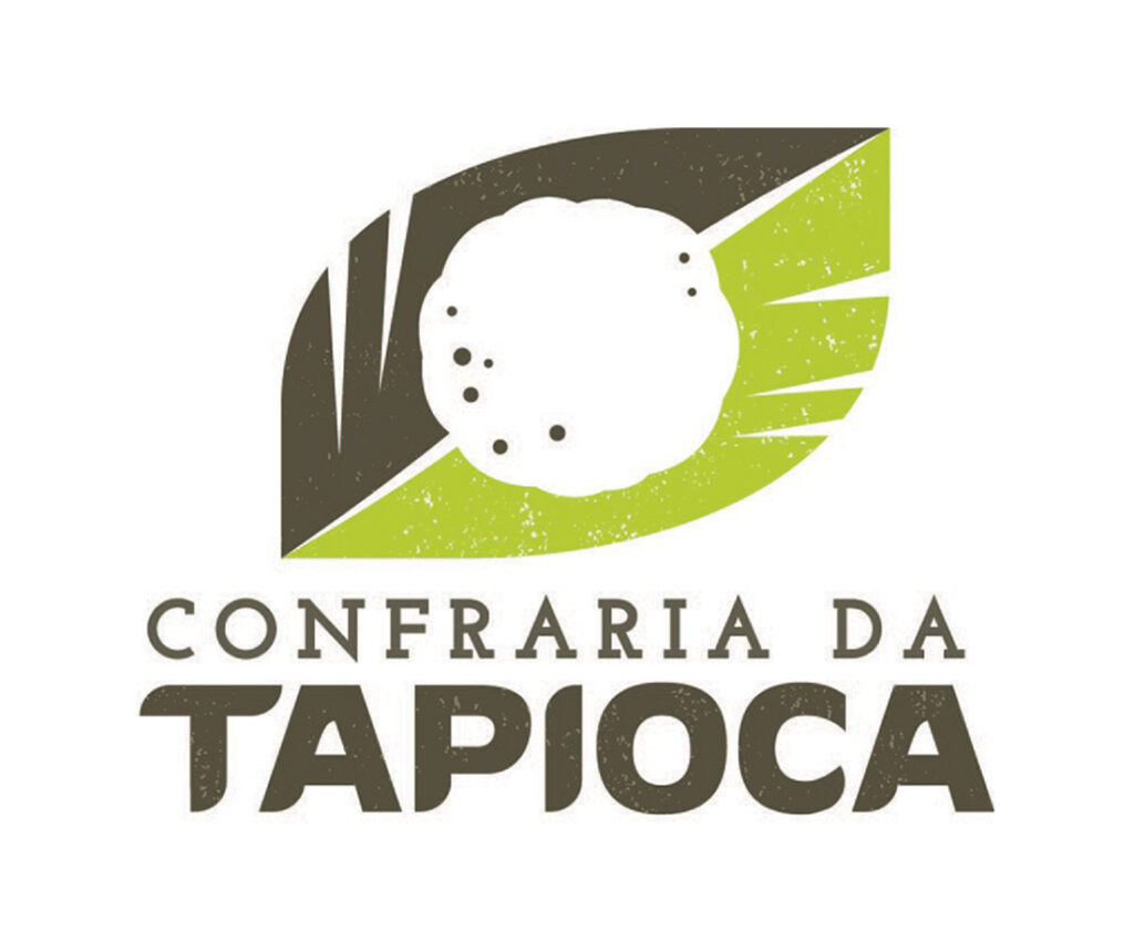
The logo for Confraria da Tapioca embodies the rich heritage and culinary tradition of Brazil’s beloved street food, tapioca. Drawing inspiration from its indigenous origins, the design portrays tapioca’s authentic beginnings, served on a leaf by native peoples. Subtle yet impactful, it captures the essence of Confraria da Tapioca’s commitment to serving traditional delights with a nod to their historical roots.
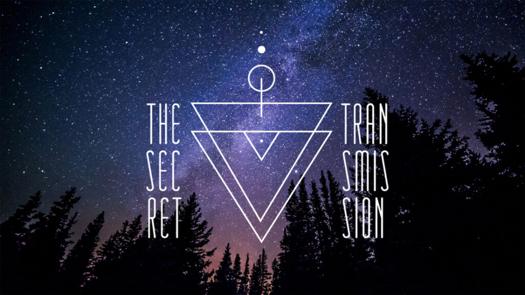
This logo for The Secret Transmission, an indie electronic music duo hailing from Oxford, is inspired by sacred geometry and futuristic aesthetic. The design transmits an air of mystique and intrigue, transporting viewers into an otherworldly realm. With its edgy yet sophisticated look, the logo perfectly encapsulates the duo’s avant-garde approach to music. Evoking a sense of cosmic wonder, it invites audiences to embark on a sonic journey beyond the realms of the ordinary.
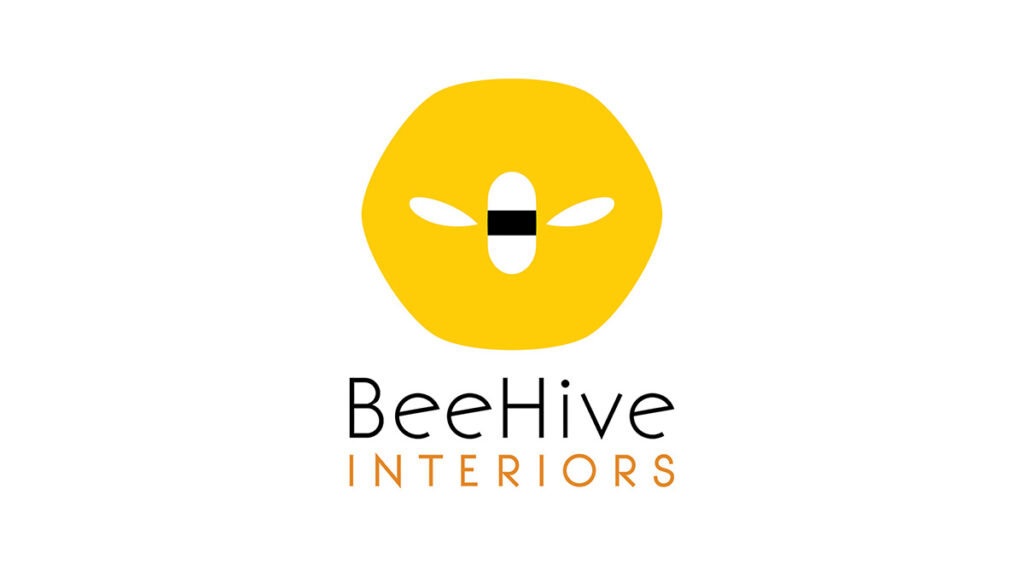
Inspired by the client’s surname, which means “bee,” this design features a sleek beehive silhouette, symbolizing community and industriousness. With its minimalist approach and bold, contrasting colors, the logo strikes a balance between modernity and playfulness, being at the same time vibrant and aprochable.
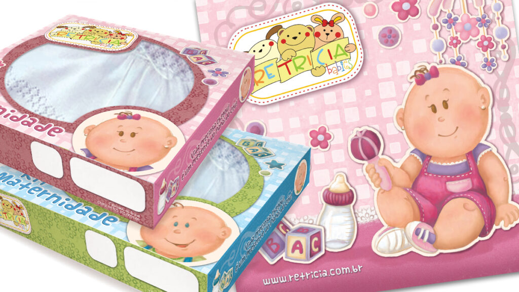
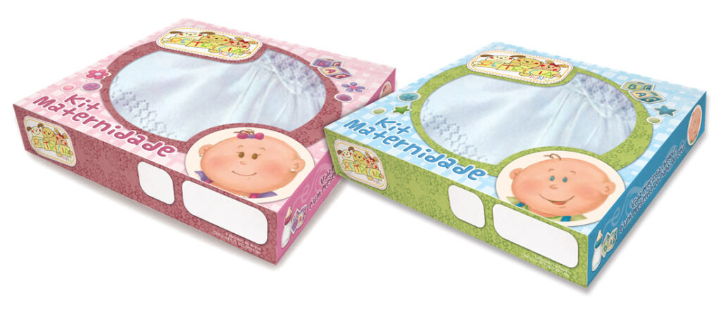
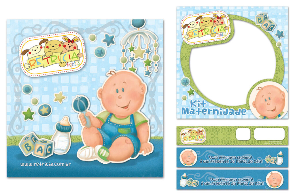
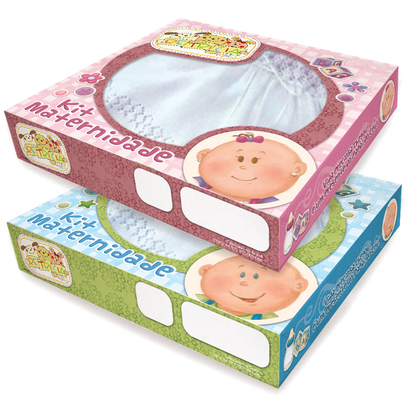
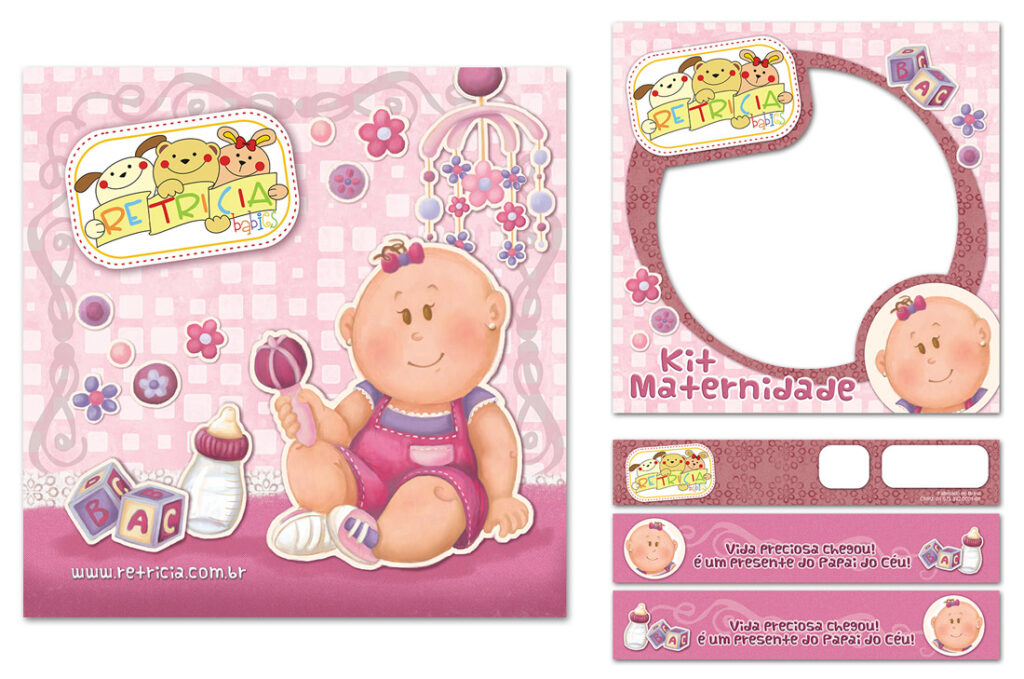
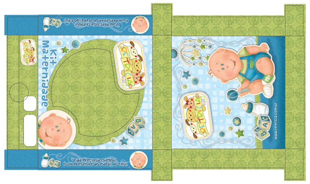
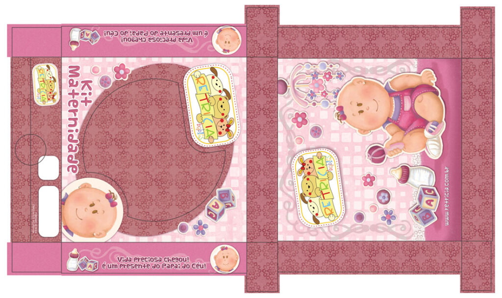
This client wanted something really special for their baby’s first outfit product – something unique and charming. They shared all the details about their vision, and I got to work crafting illustrations and packaging that really captured the magic of that first precious outfit. It was all about celebrating that sense of joy and excitement, creating something truly memorable for families to celebrate their new arrival.
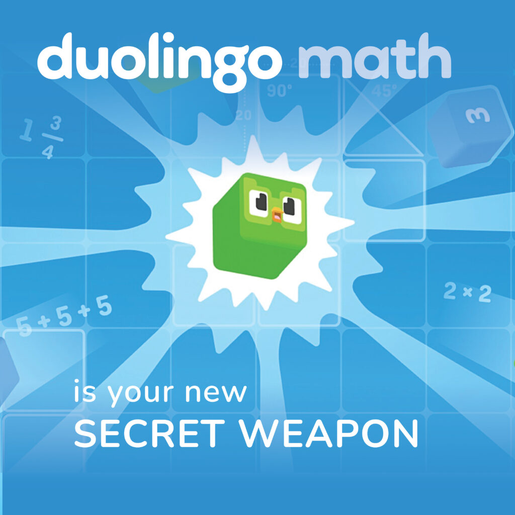
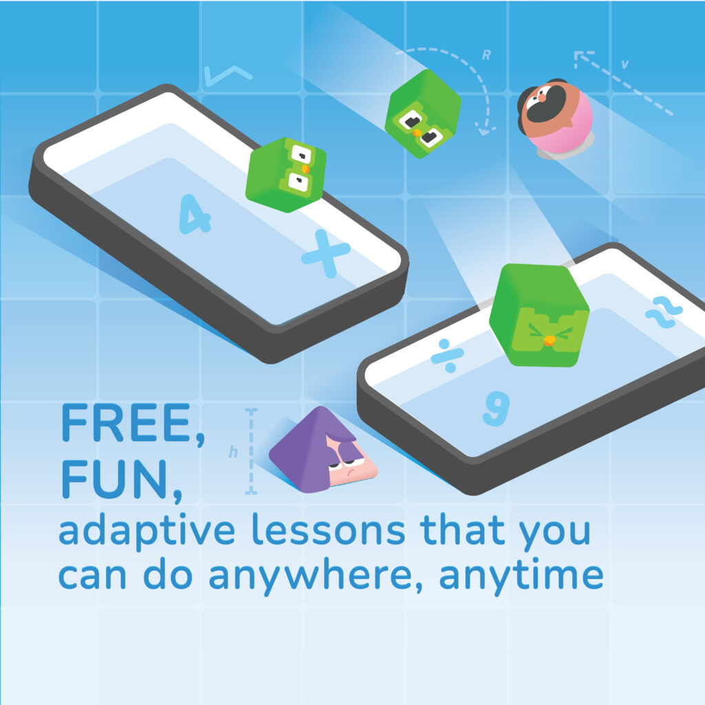
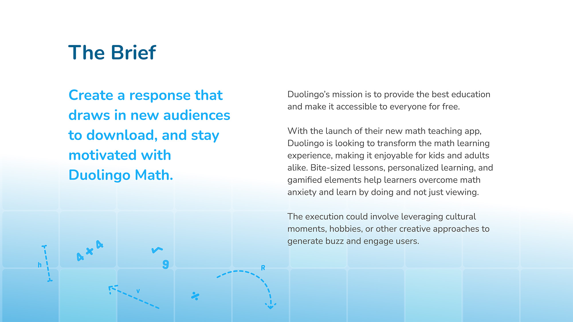
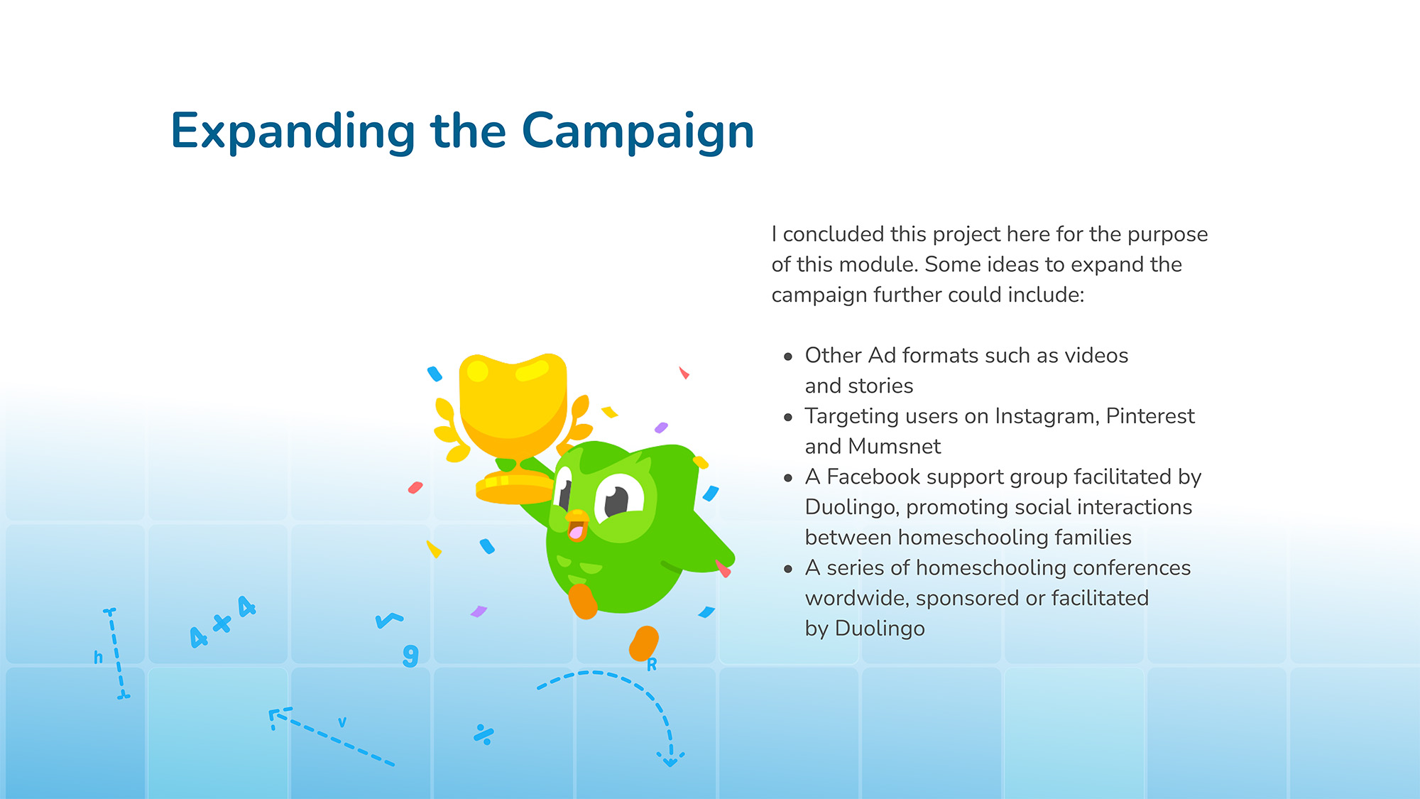
In response to the D&AD New Blood Awards competition, this project aims to Inspire audiences to build new maths habits through a new app launched by Duolingo.
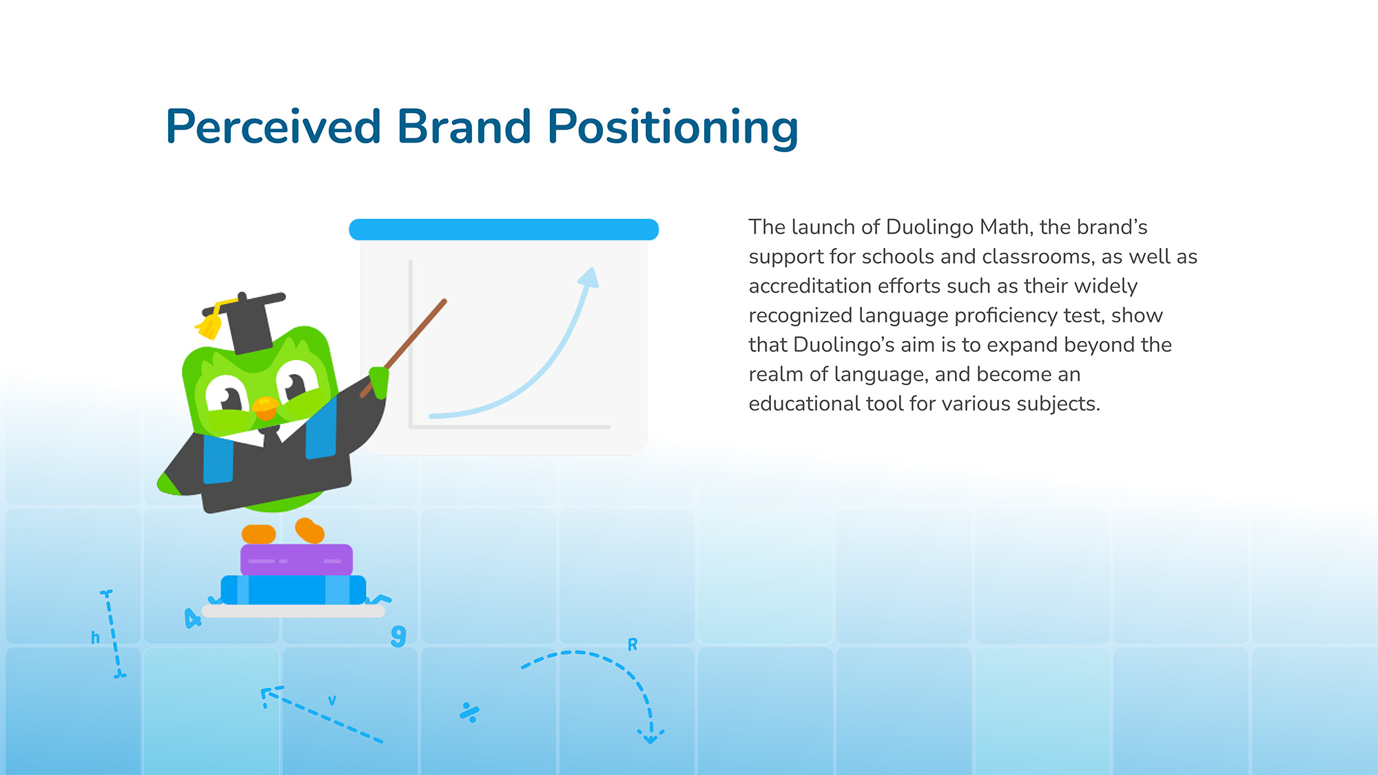
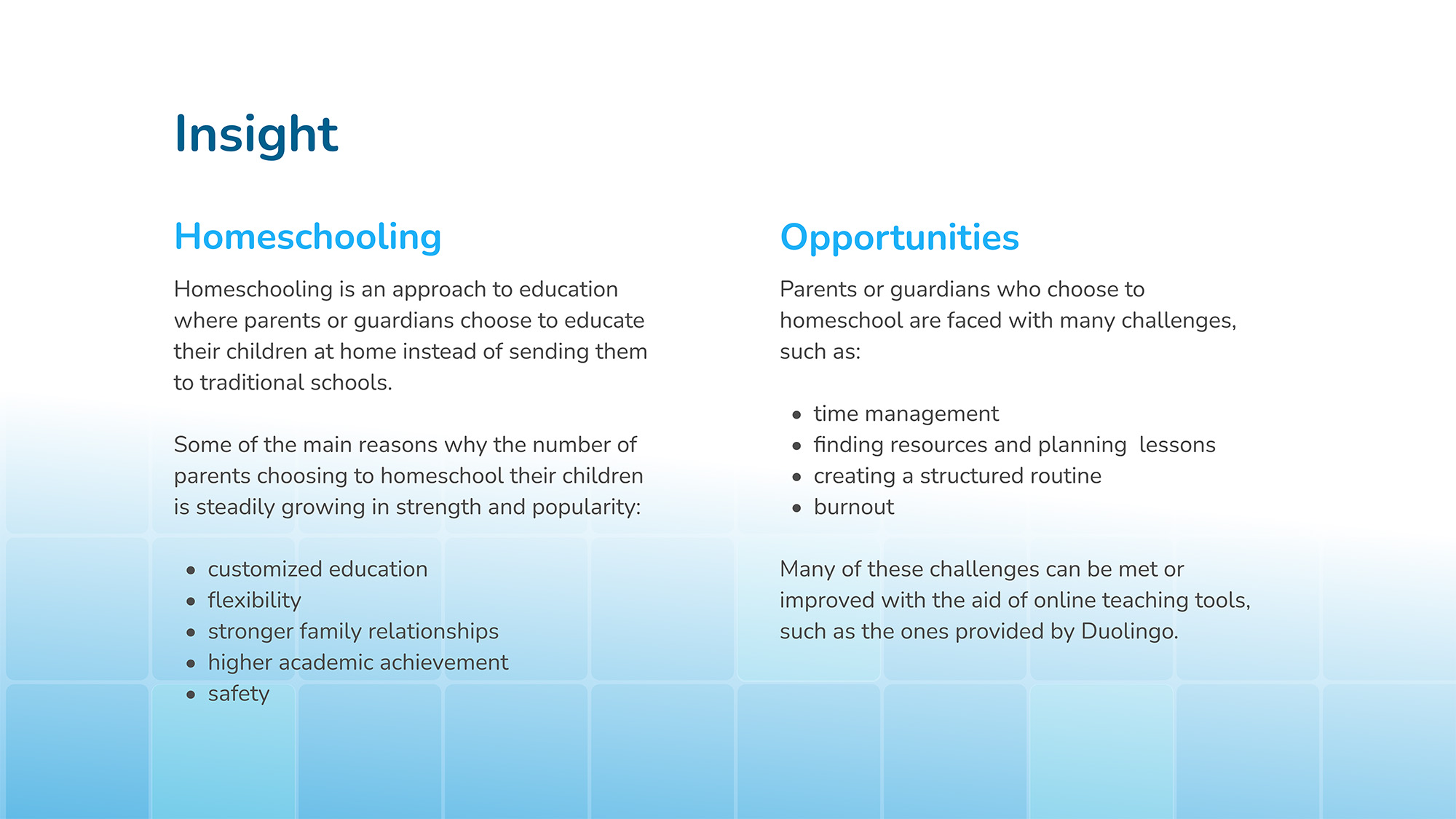
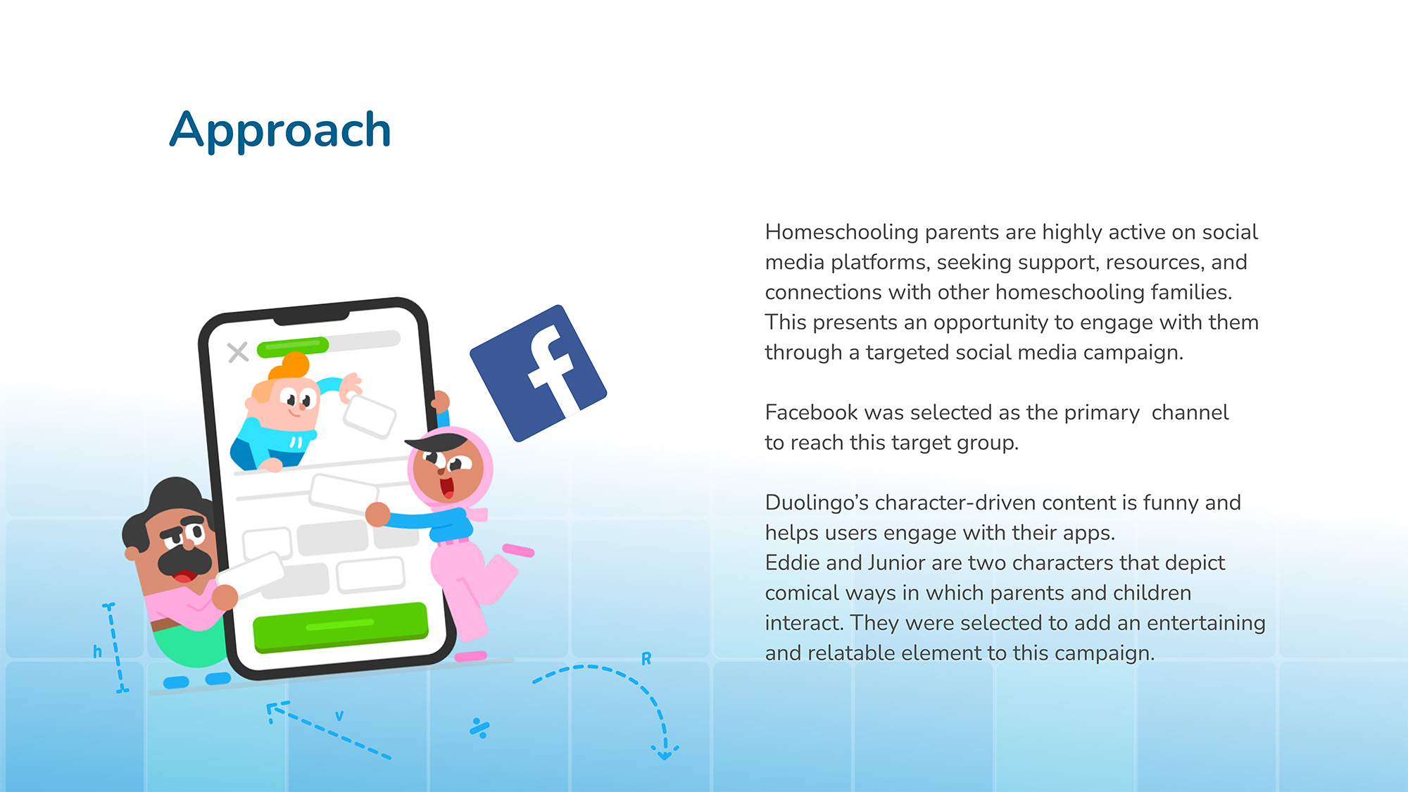
Through extensive research about Duolingo’s brand positioning and the target public, I identified a potential new market for Duolingo among home-schooling parents. The new app presents an opportunity to tap into a demographic seeking innovative educational resources.
Home-schooling parents often prioritize interactive and engaging learning tools for their children, aligning with Duolingo’s mission to make education enjoyable and accessible to everyone. By positioning Duolingo Math as a valuable addition to their home-schooling curriculum, we can encourage parents to download and stay motivated with the app, ultimately helping their children build a daily habit of learning mathematics. There is also great potential to expand Duolingo’s reach into other school subjects. This approach not only expands the company’s reach but also reinforces its commitment to making learning fun and impactful for learners worldwide.